Cooking · Navigation
Jump from an ingredient to the right step
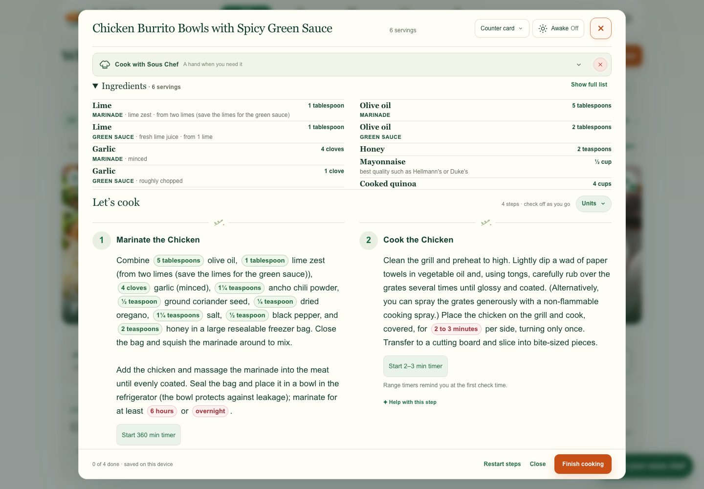
I added Find in steps so a cook can jump straight to the instructions that use an ingredient. I tested both garlic matches and the controls for moving between them.
Look What I Cooked
I redesigned the recipe toolbar to fit more ingredients on screen, then checked the layout on mobile and desktop.
Product direction · AI-assisted prototyping · Visual QA
119 CSS px reclaimed
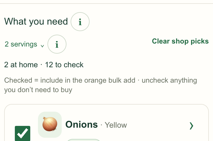
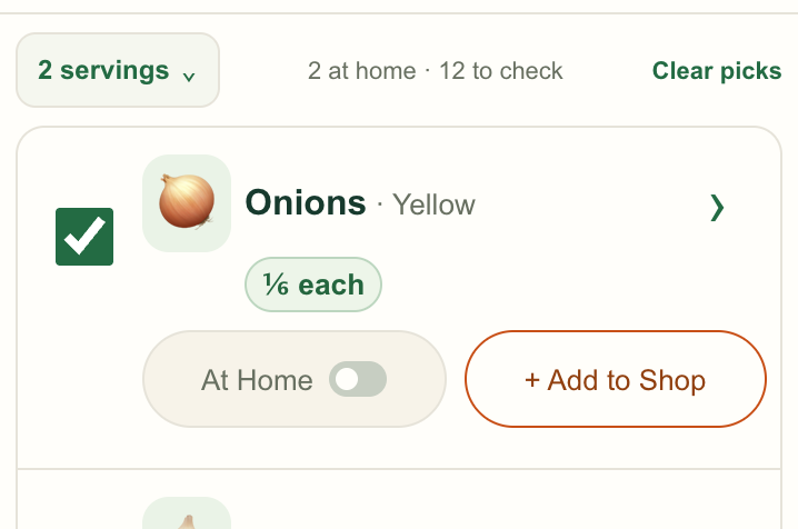
The first ingredient starts higher in a matched comparison at 393 CSS pixels wide.
Selected work
Cooking · Navigation
I added Find in steps so a cook can jump straight to the instructions that use an ingredient. I tested both garlic matches and the controls for moving between them.
Shopping · Ingredient quantities
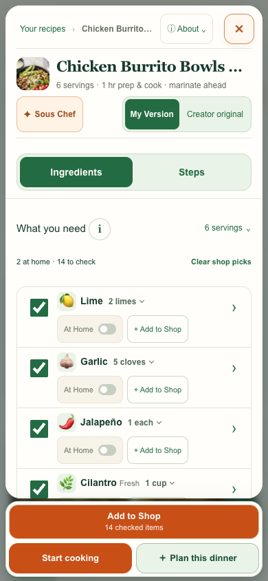
I changed “Check amount” to 2 limes when the recipe gave a whole-fruit count. The recipe still shows the measured juice and zest when the cook opens the row.
Recipe layout
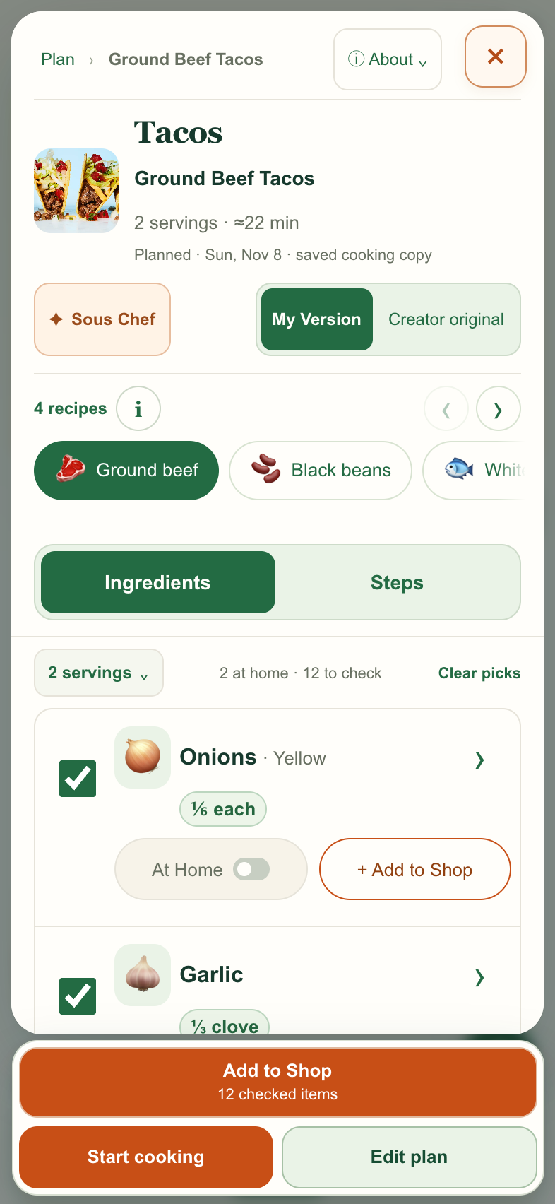
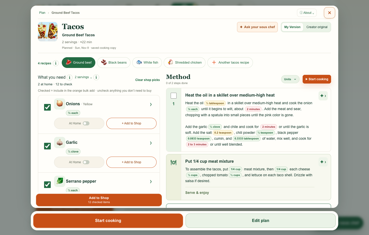
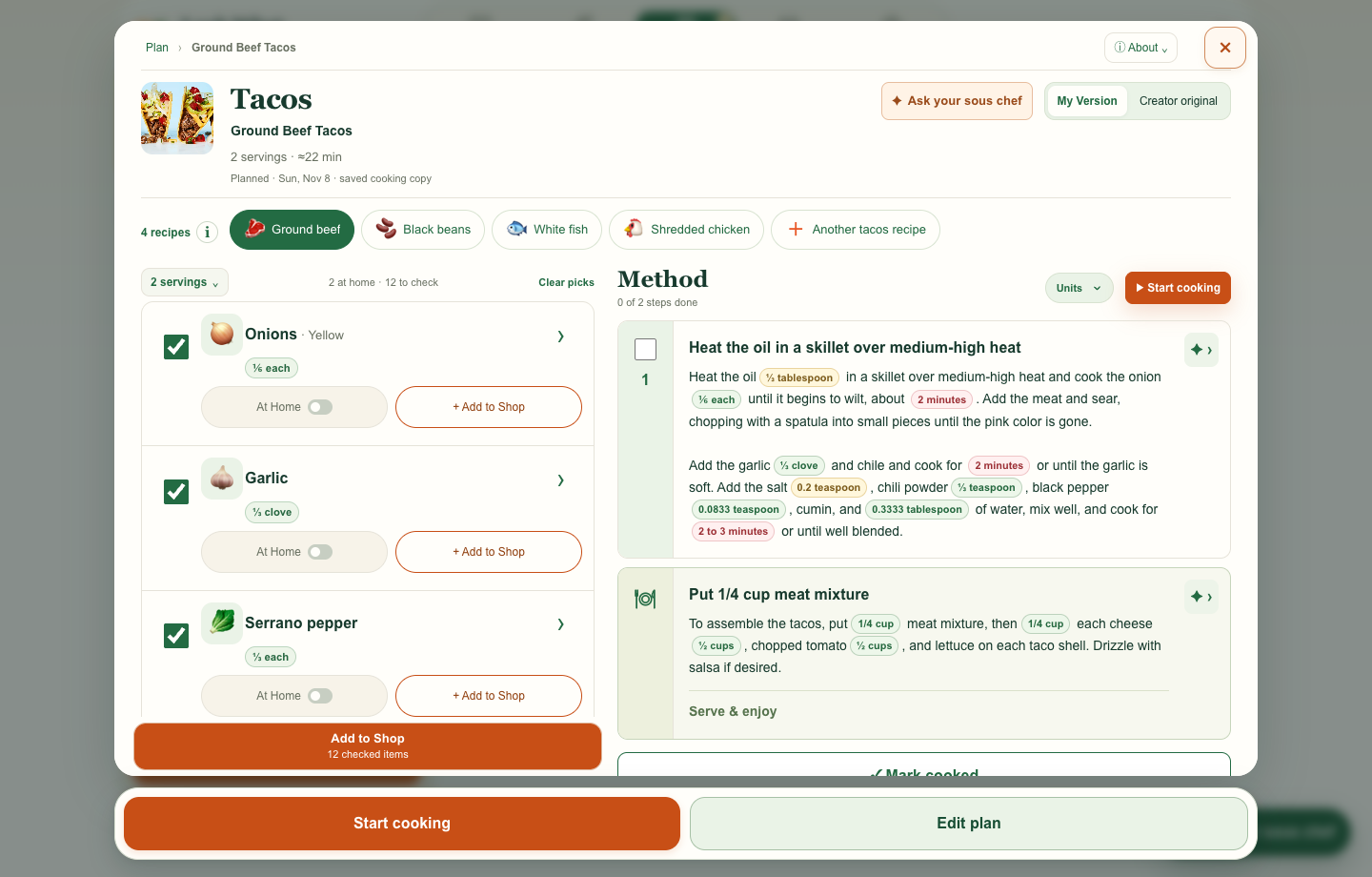
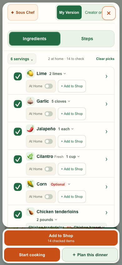
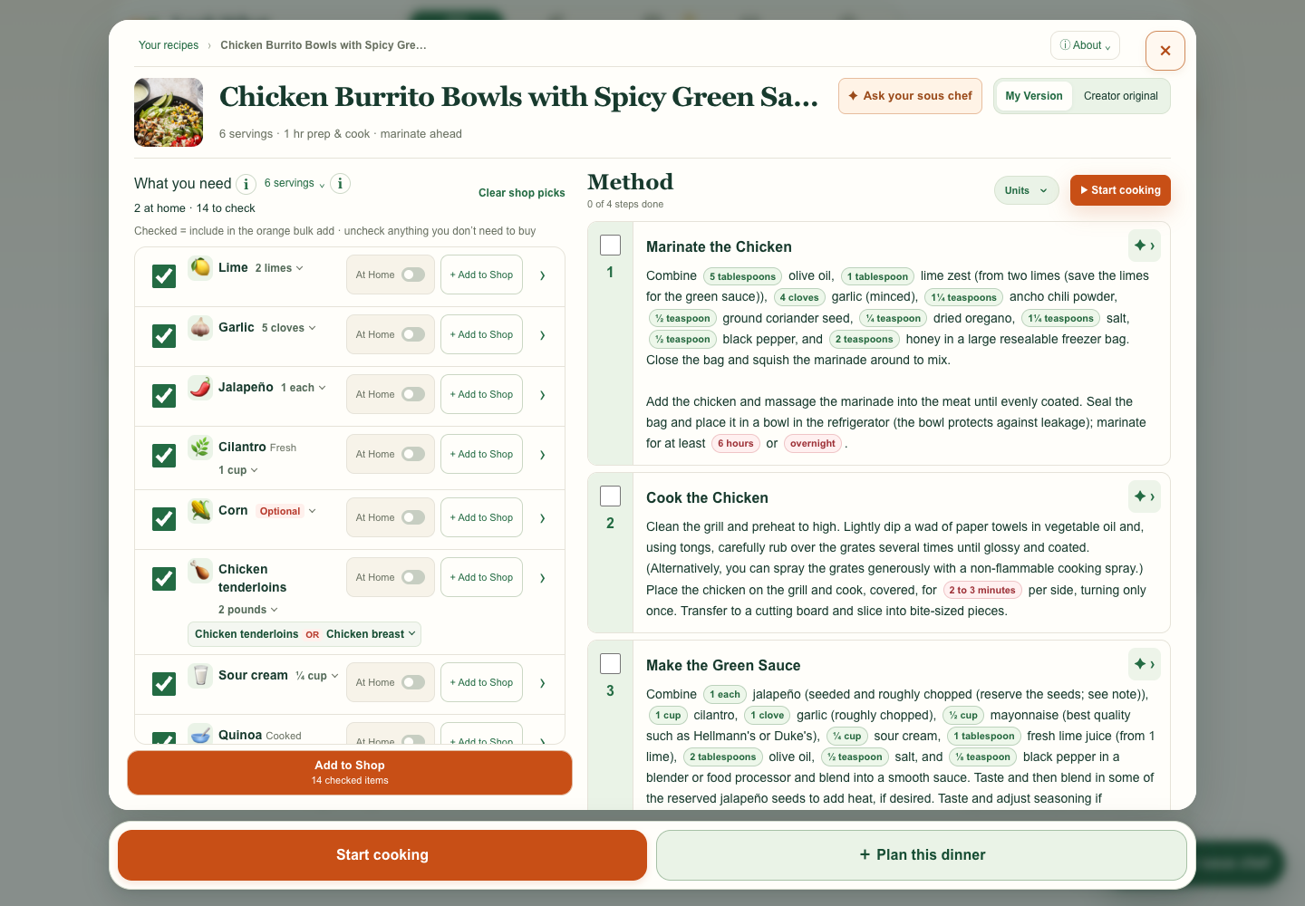
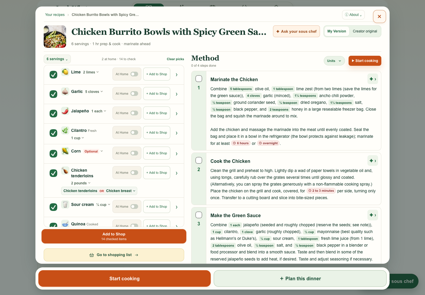
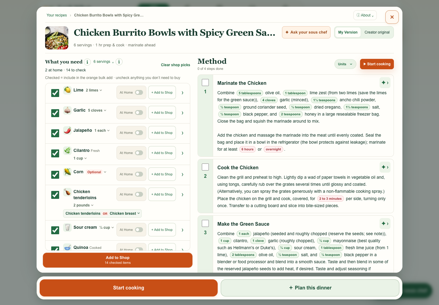
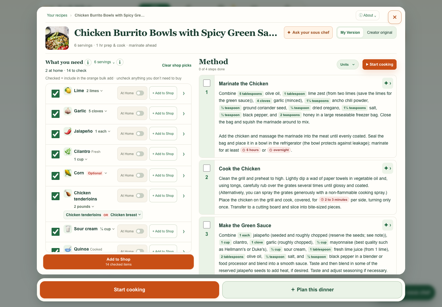
My request I asked to move servings, stock status, and Clear picks onto one line to give ingredients more room. I caught the old toolbar resurfacing in a later preview and asked that the compact layout carry forward.
What changed Servings, stock status, and Clear picks share one row, so the ingredient list starts sooner.
Full comparison gallery
Each comparison explains the request or design decision it tested. Before shows the earlier design. After shows the improvement, with concepts labeled separately. Select any screenshot to enlarge it.
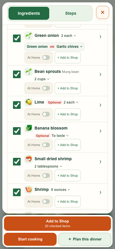
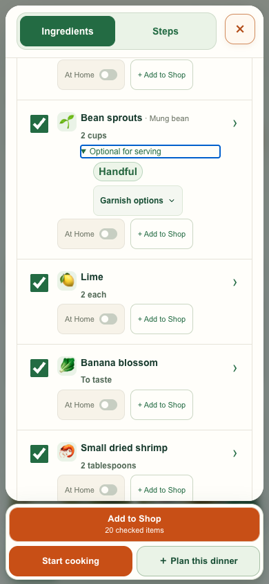
My request Fit more ingredients on a phone without making the rows feel cramped. Put the amount beside the name when it fits, with Optional before the amount.
What changed The same recipe shows more rows. Long labels wrap, and the amount stays easy to spot.
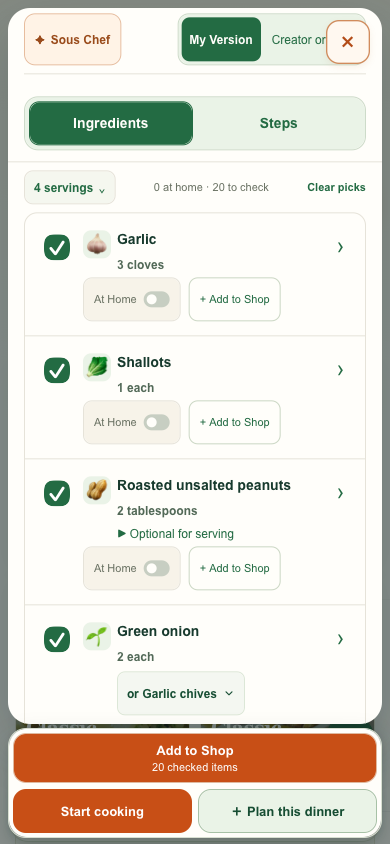
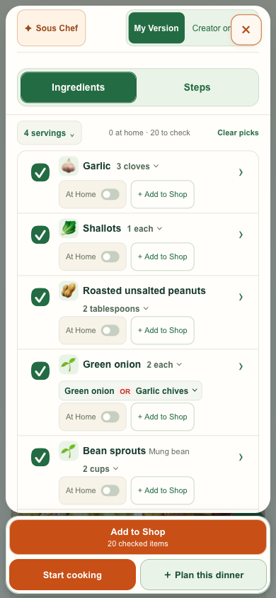
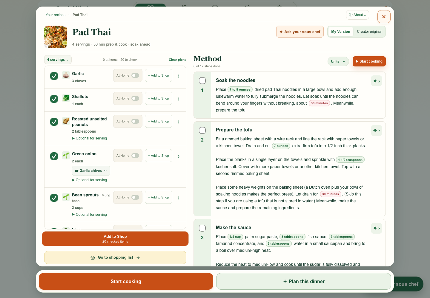
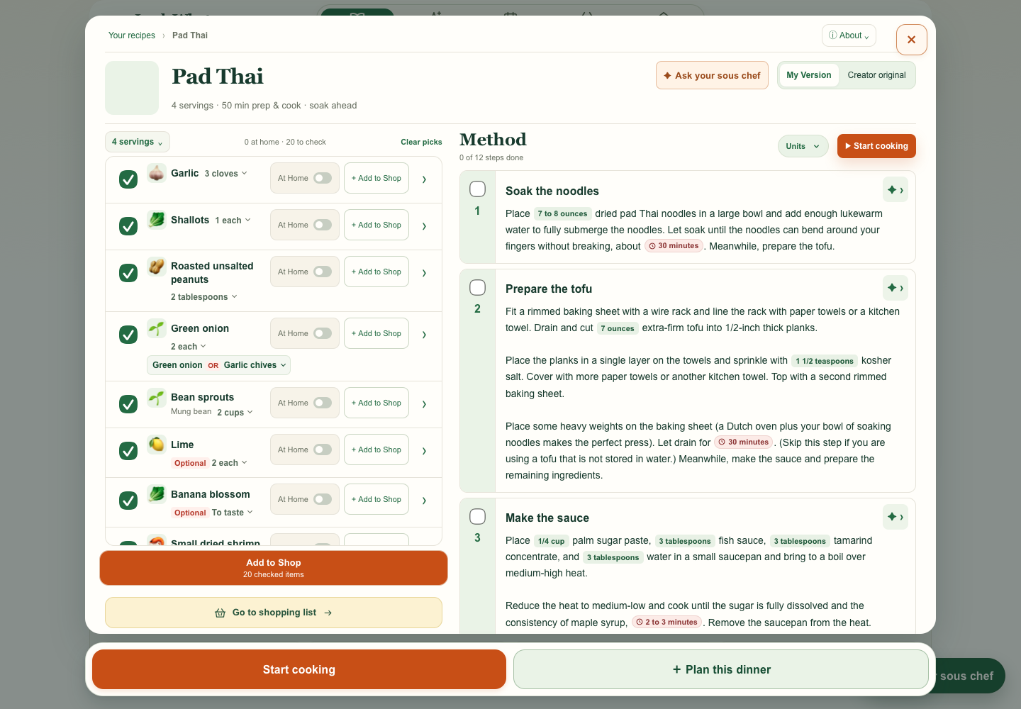
Optional garnish and long labels · mobile · desktop · 320 px WebKit
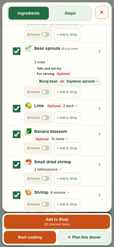
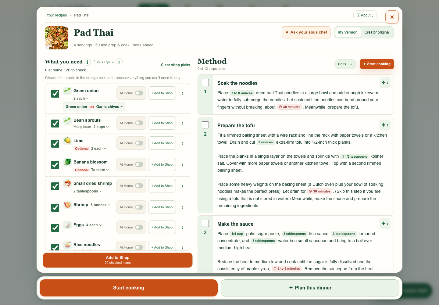
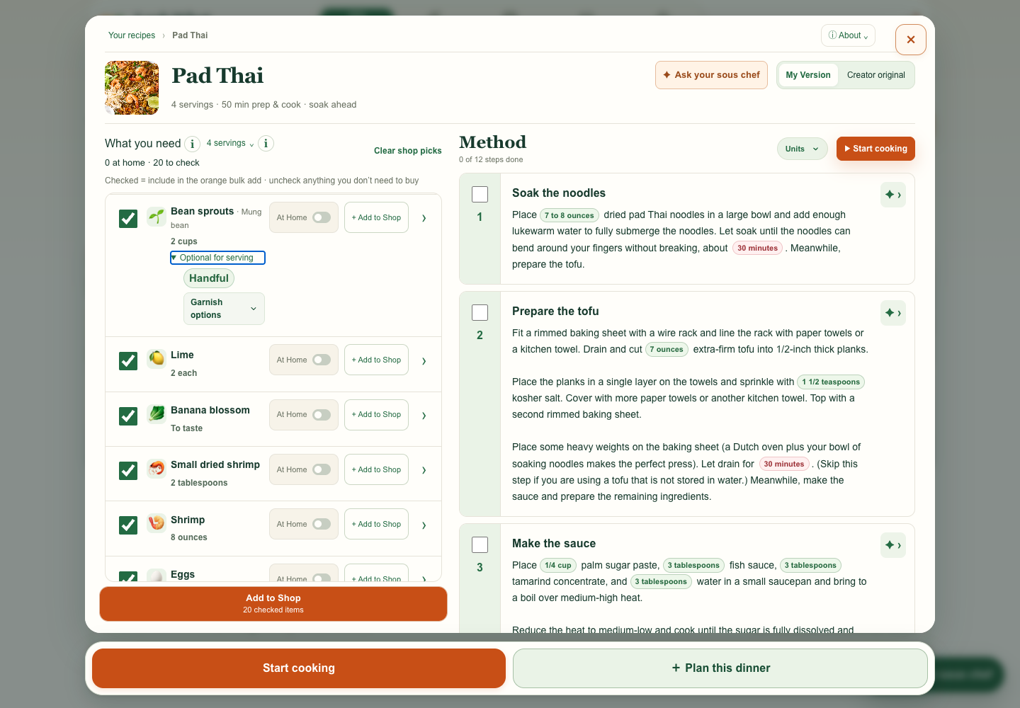
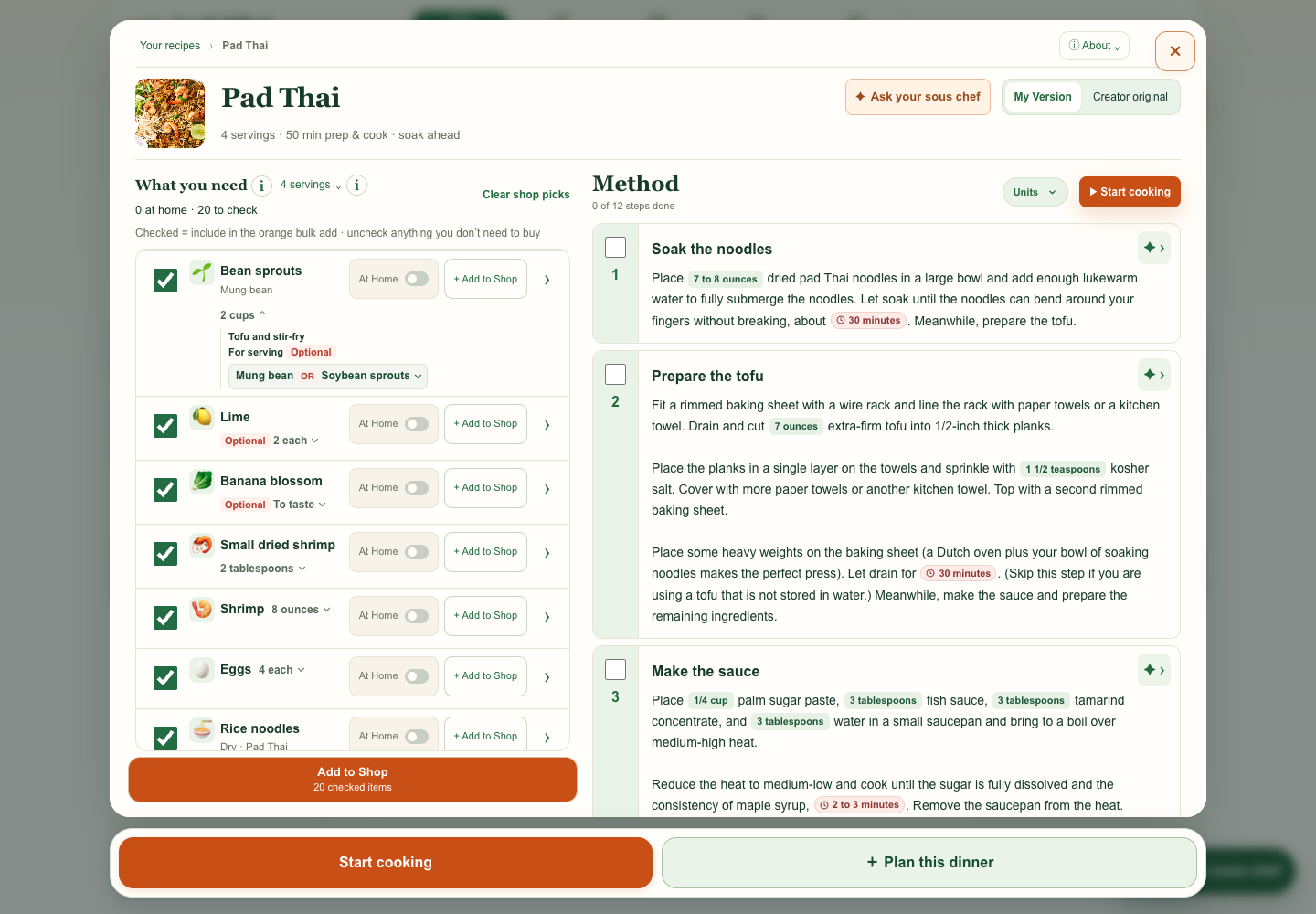
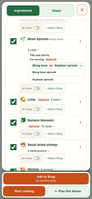
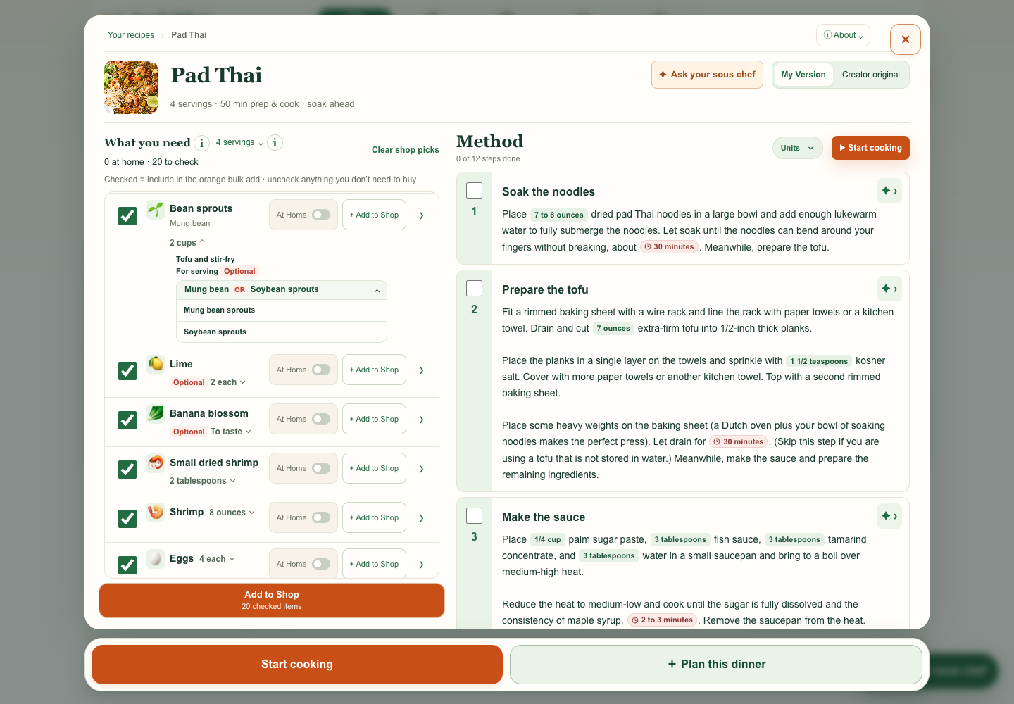
My request I flagged that Optional looked tied to the substitute. Keep a required ingredient required, even when it has an optional serving use.
What changed The row still shows 2 cups. The expanded amount labels only the serving use Optional, and the OR menu opens separately.
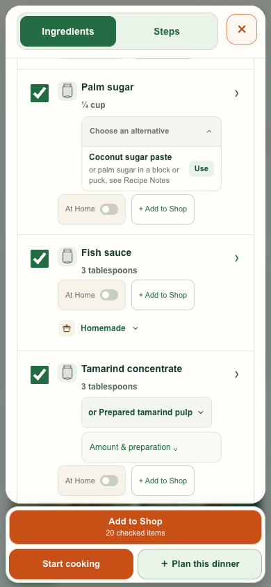
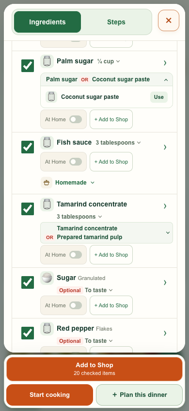
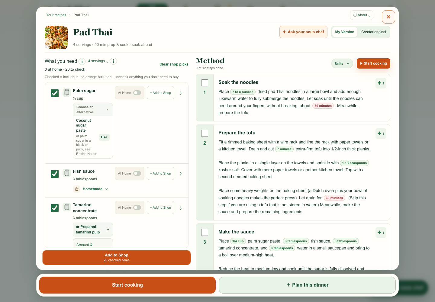
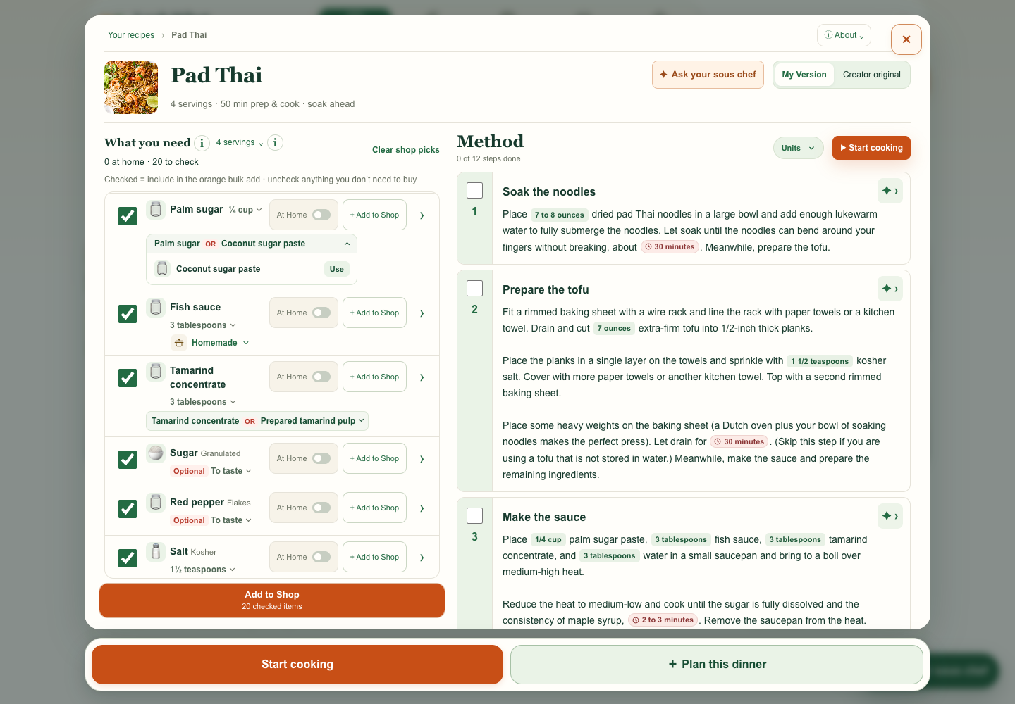
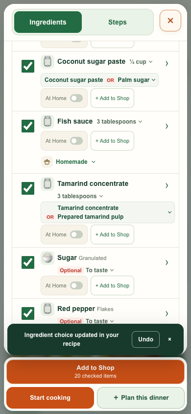
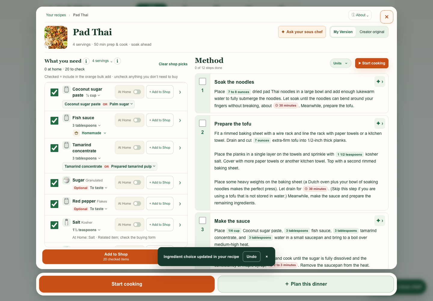
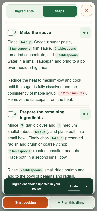
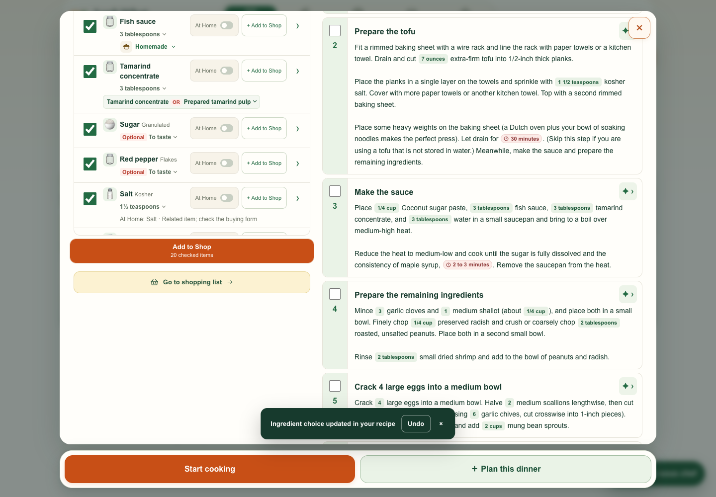
I asked for the alternative to look like a grocery item and wanted to see what happened after tapping Use. The preview swaps in Coconut sugar paste in both Ingredients and Method, and Undo restores Palm sugar.
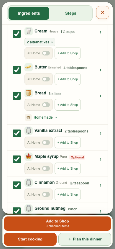
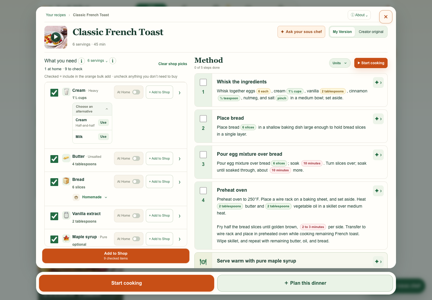
I asked for a count when there are two or more substitutes. Heavy cream shows “2 alternatives” until opened, then lists Half-and-half and Milk.
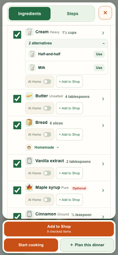
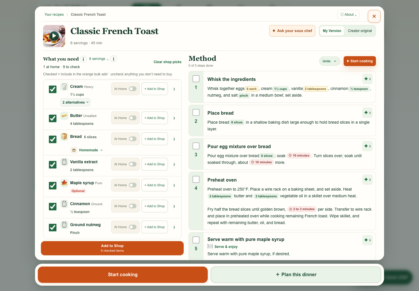
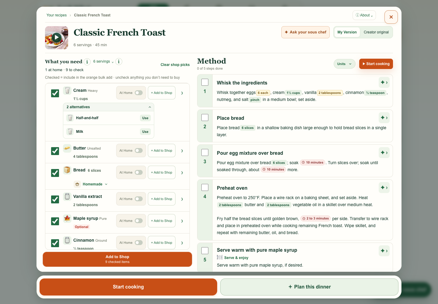
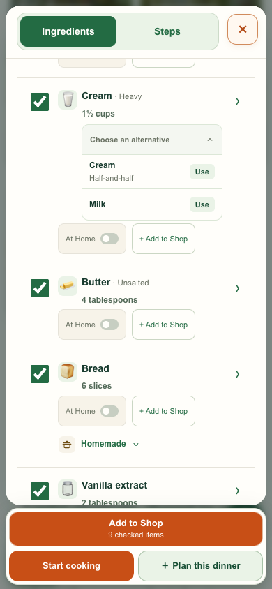
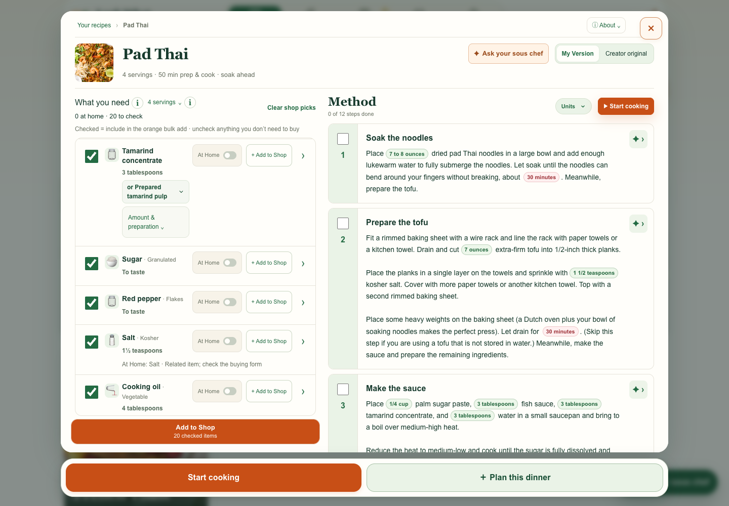
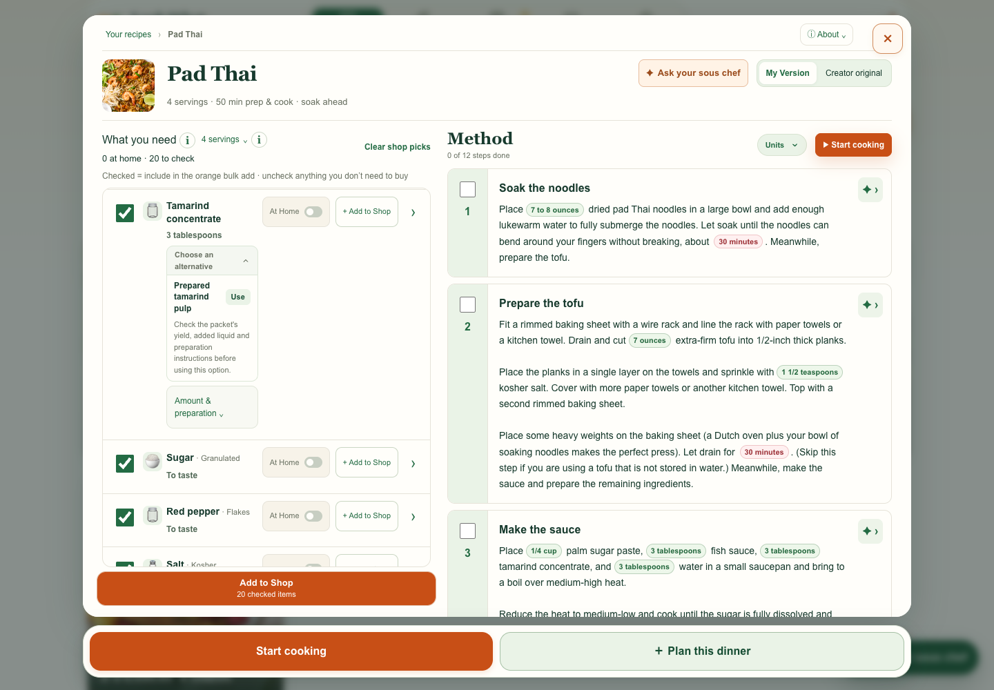
I called out a redundant Amount & preparation dropdown. I asked for one shared alternative pattern across recipes, with a visible OR for a single substitute.
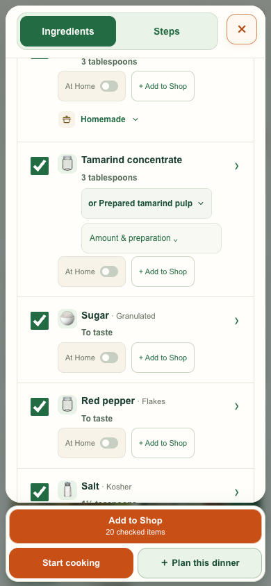
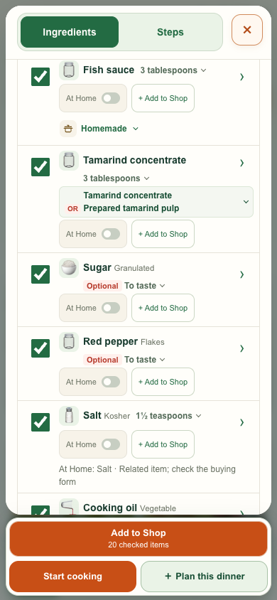
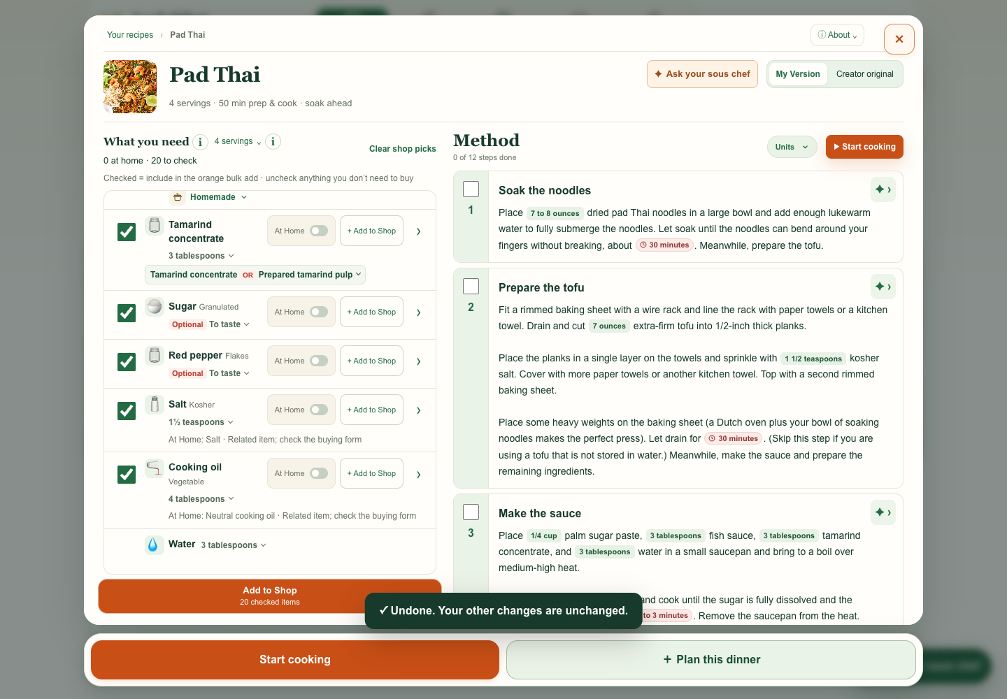
I asked for OR to start the second line only when the names wrap. The wrapped version aligns the two ingredient names and leaves the red OR beside the second one.
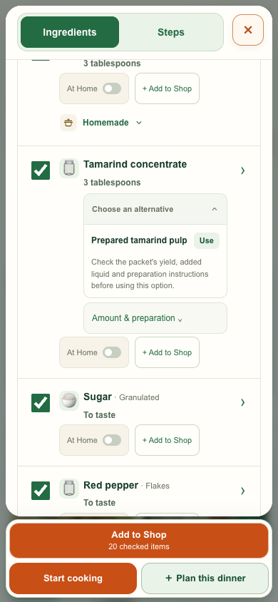
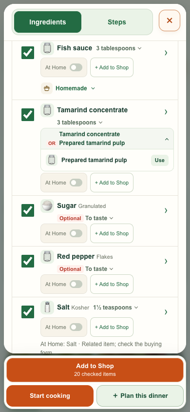
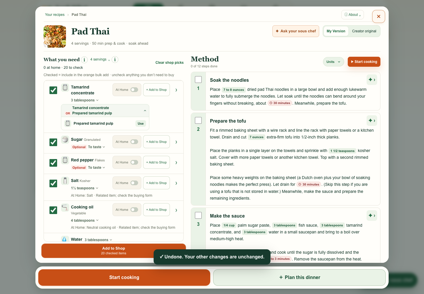
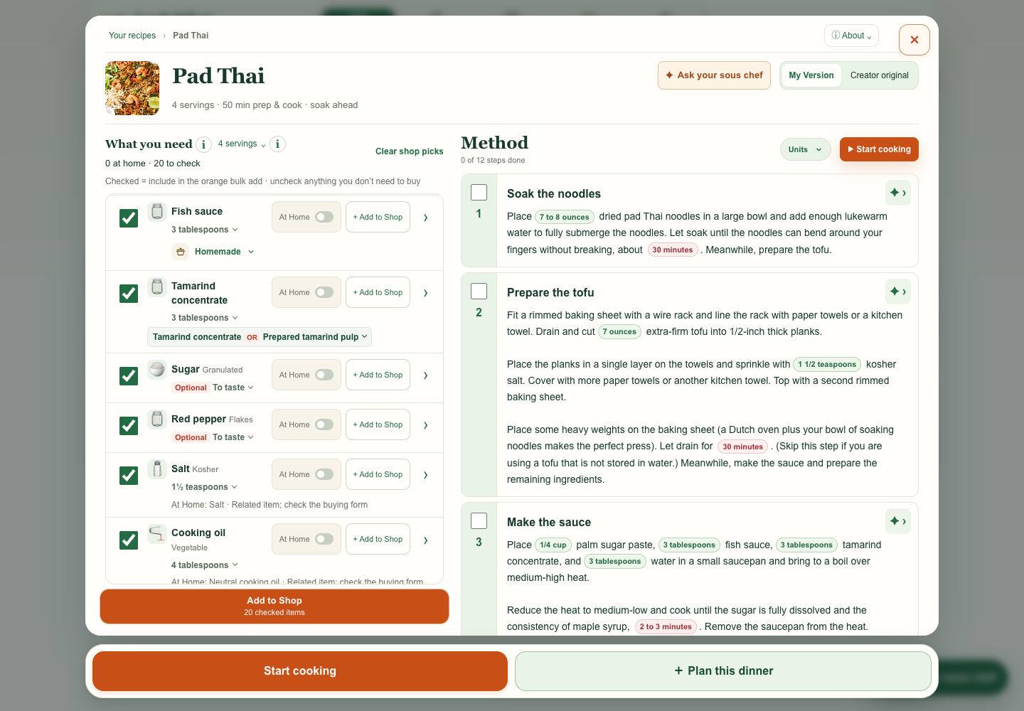
I asked to tighten the space around Homemade. The closed Fish sauce row is 8 px shorter on mobile and 15 px shorter on desktop. The mobile control keeps a 44 px tap target.
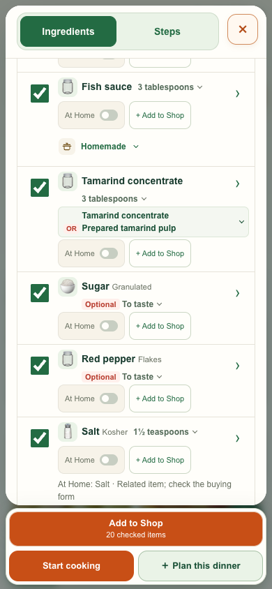
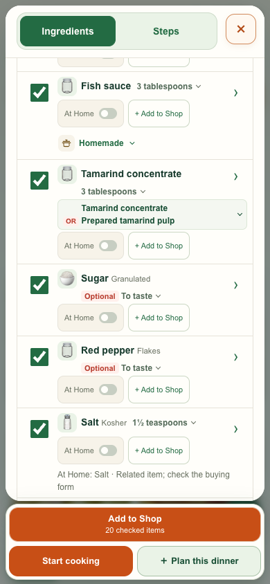
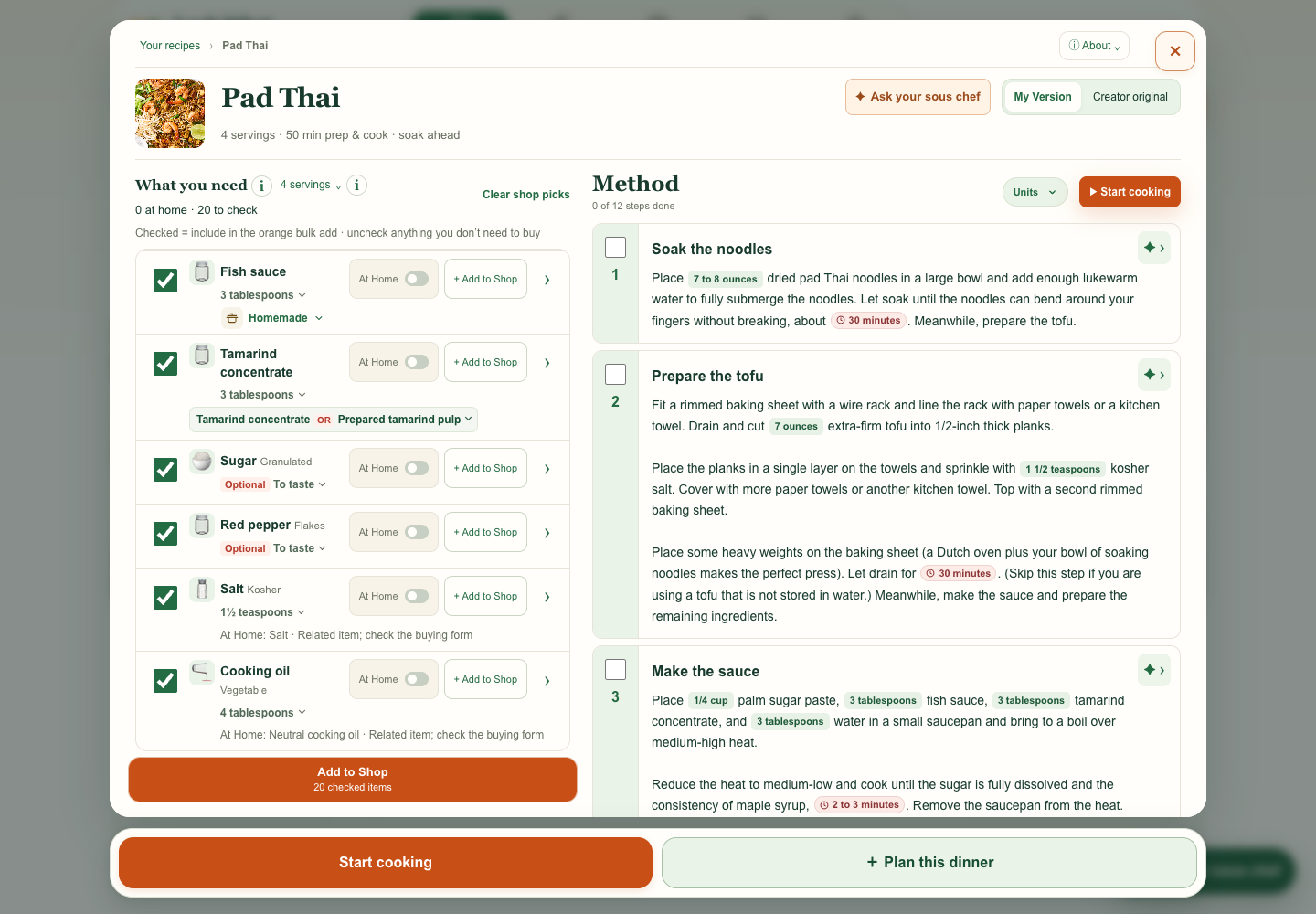
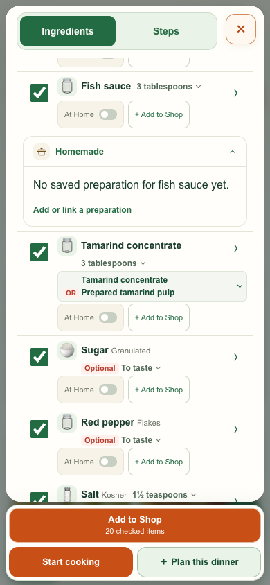
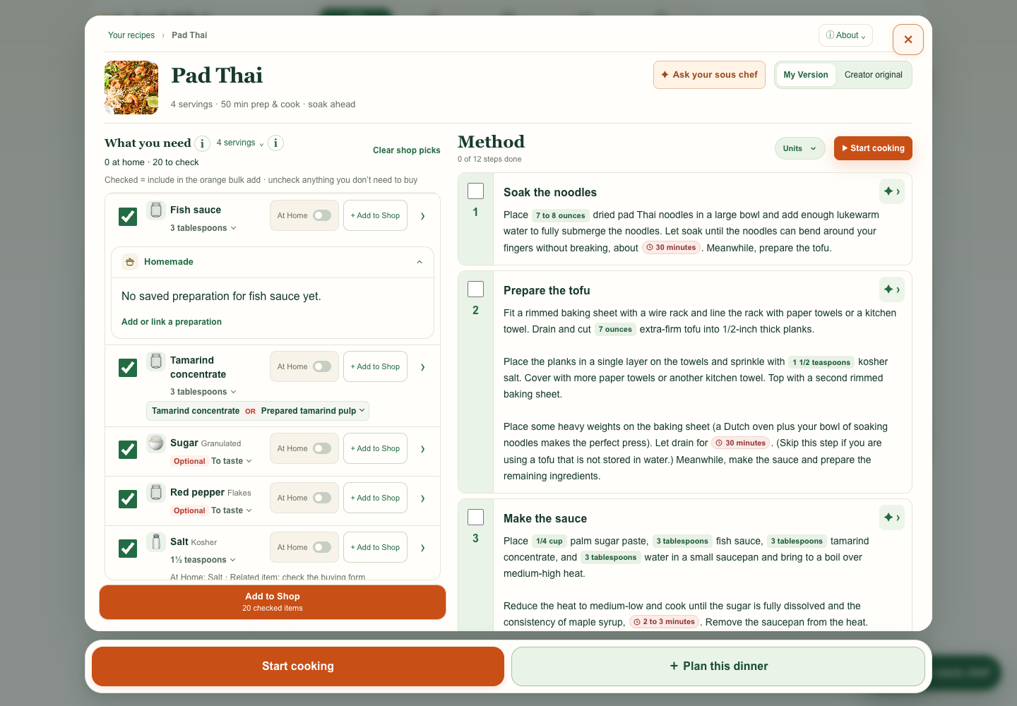
I asked for the expanded panel to use the available width and for its stock actions to look like the rest of the app. The preview groups recipe uses, stock controls, and original wording in one place.
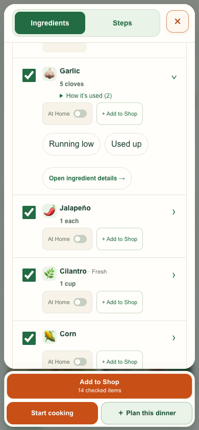
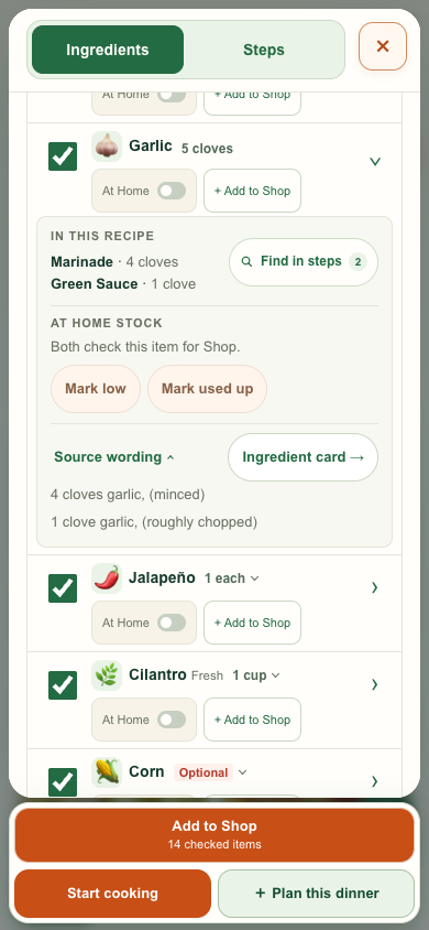
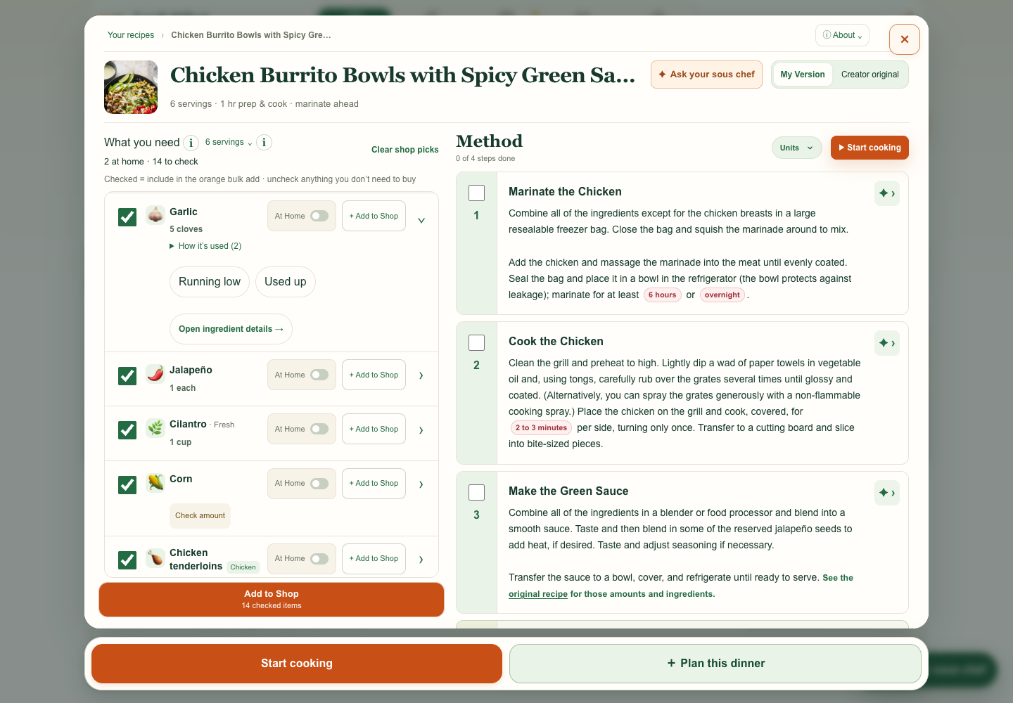
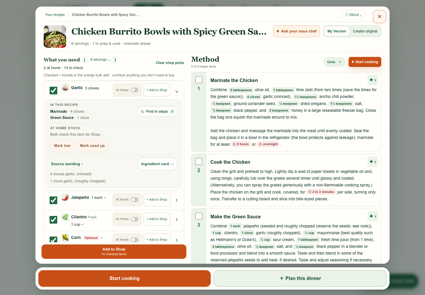
When the right panel opens, the amount breakdown closes and the amount becomes plain text. Amount breakdown on its own · mobile · desktop
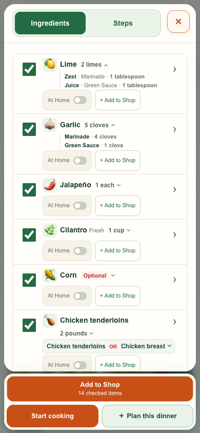
I asked for a small disclosure beside the amount so cooks could see where it goes. The Lime and Garlic examples show the quick breakdown without opening the larger details panel.
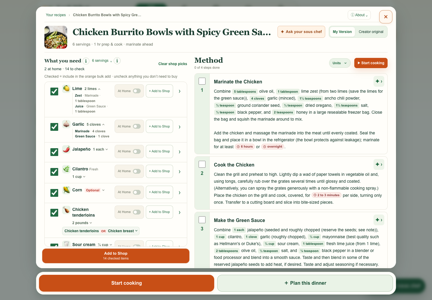
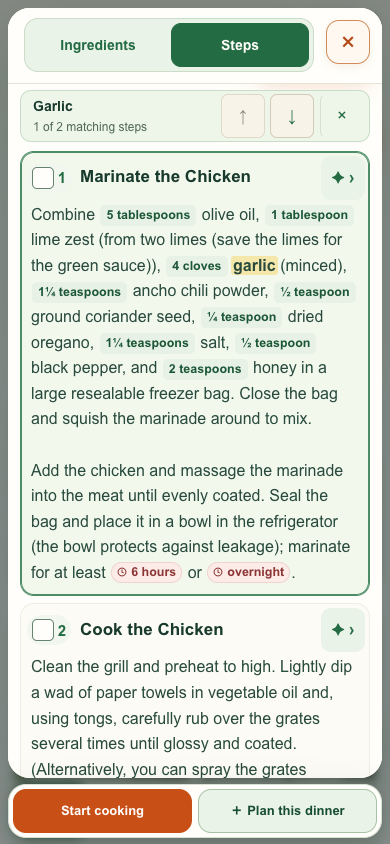
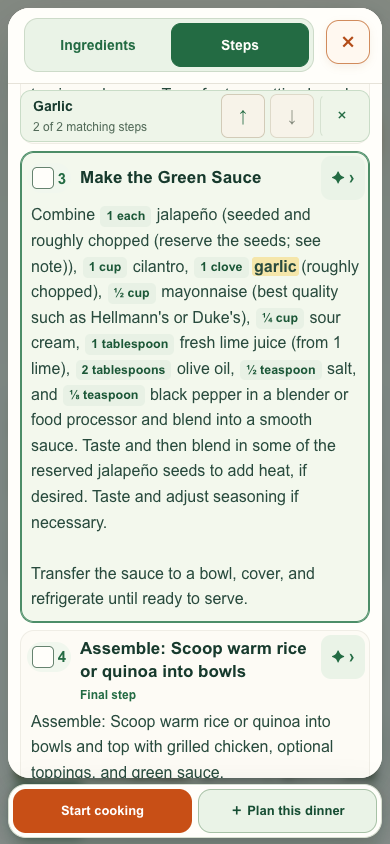
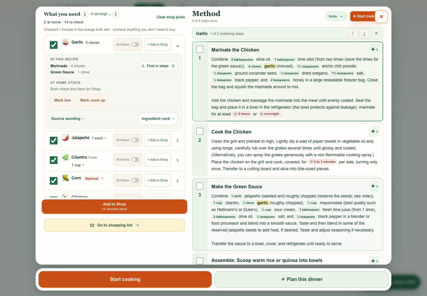
My request Let me jump from an ingredient to the steps that use it, and let me move through every match.
What changed Garlic is highlighted in the marinade and green sauce steps. The match count and arrow buttons make it clear where to go next.
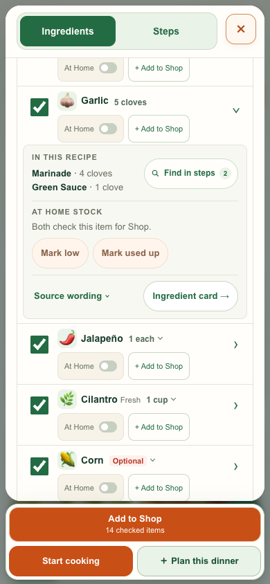
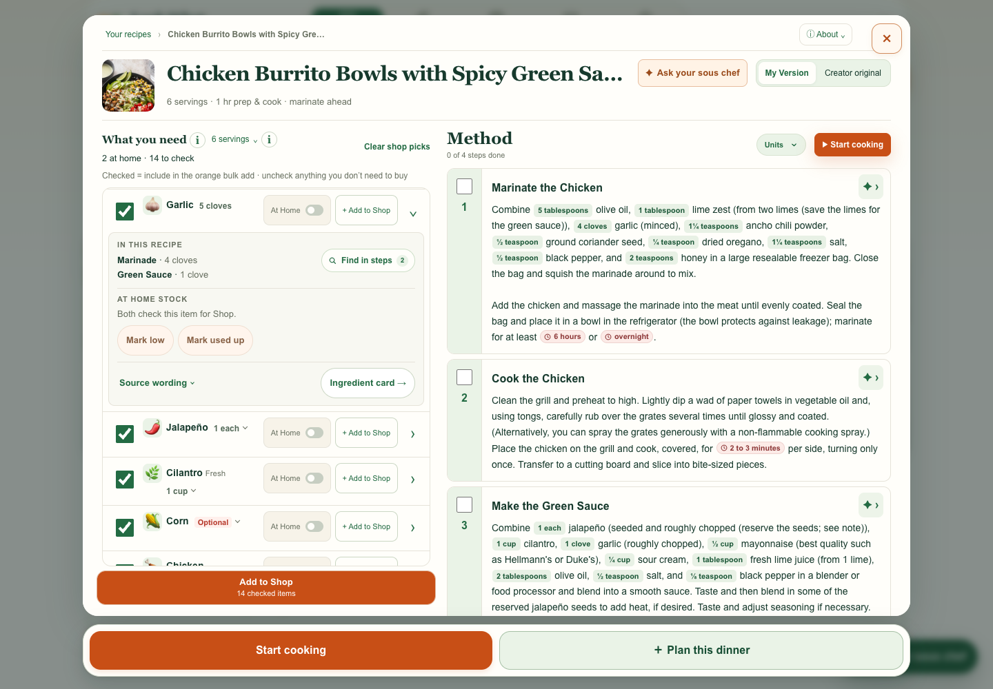
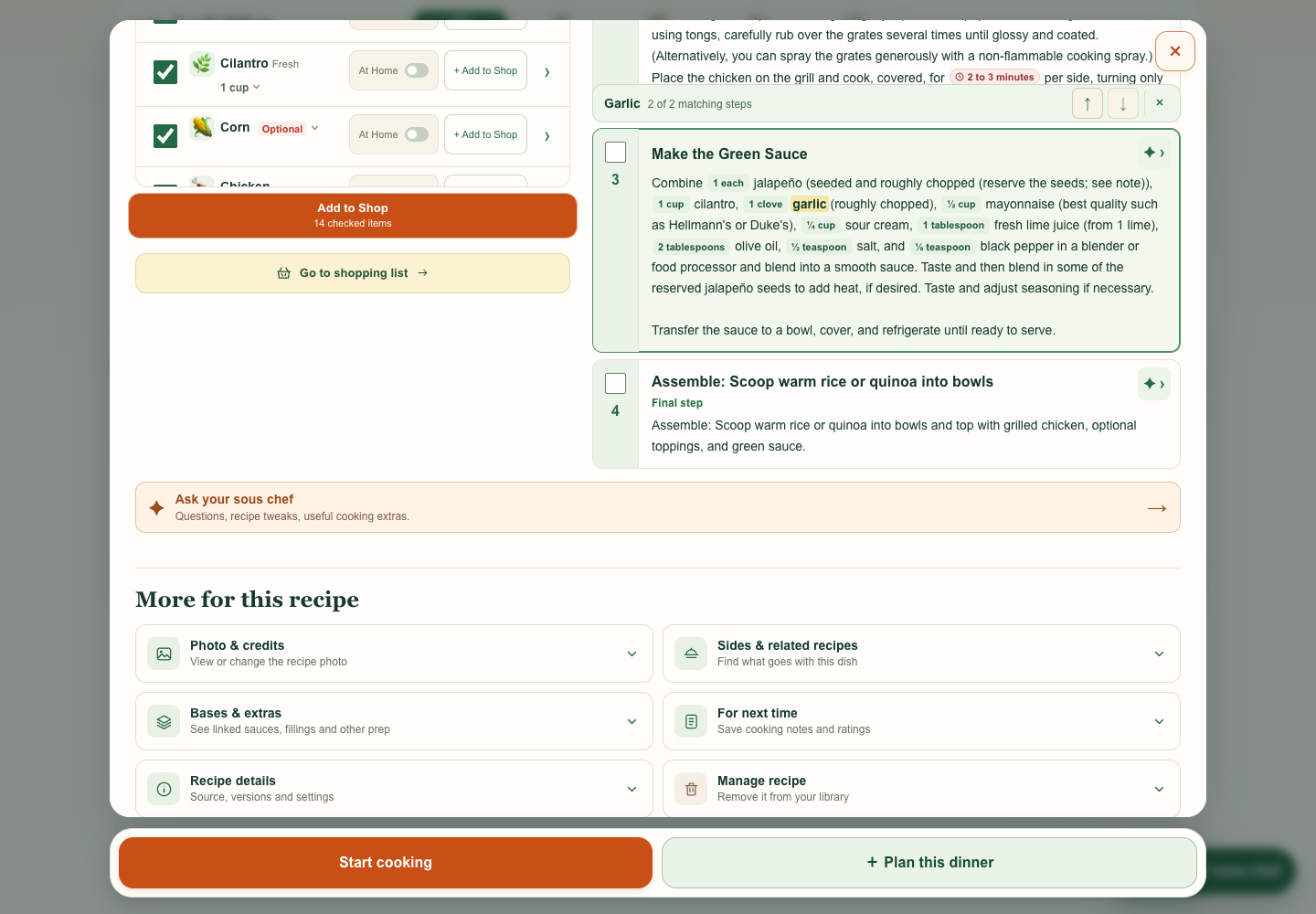
I asked for tighter spacing between method cards while keeping the instructions easy to follow. These captures compare the same steps before and after.
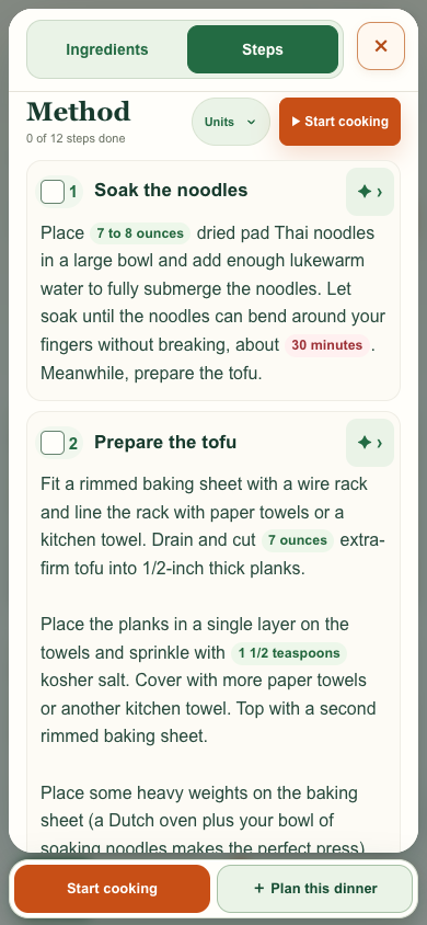
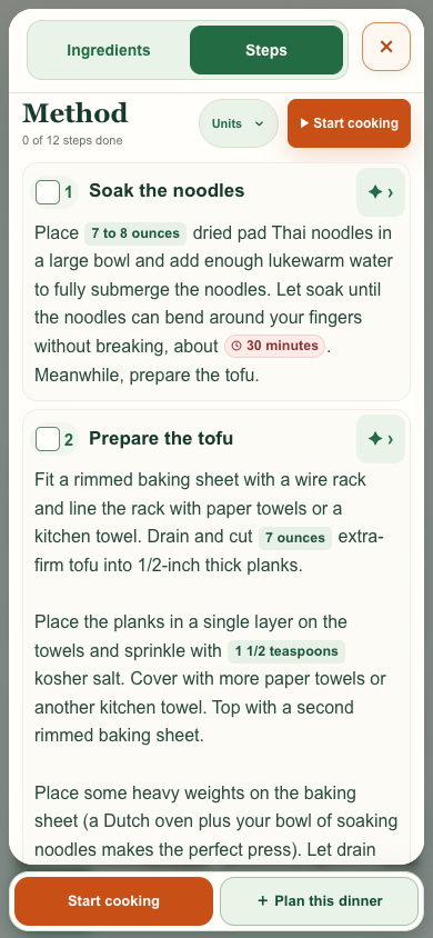
I wanted cooks to pick out quantities and times without the paragraph feeling cluttered. I asked for quieter amount badges and a distinct clock marker for durations. The method text and type size match in both captures.
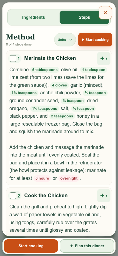
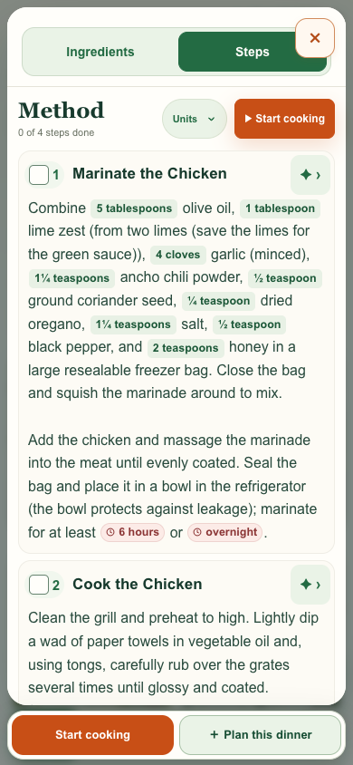
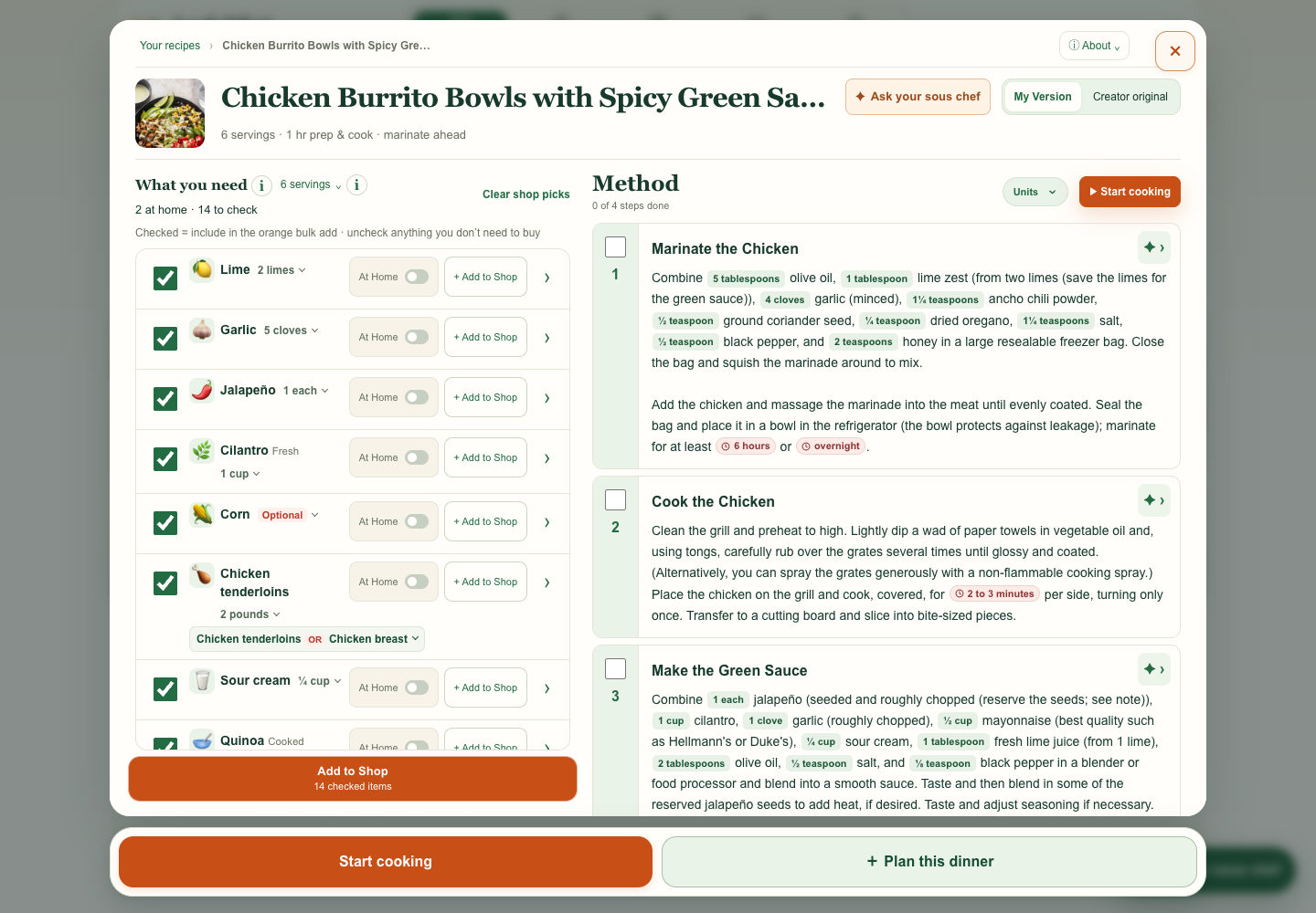
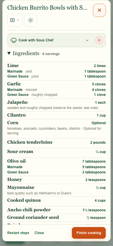
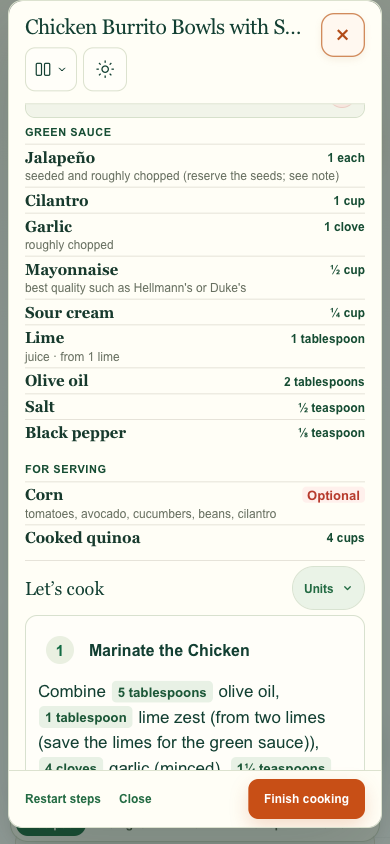
I asked for one mobile Ingredients list that opens or closes, with amounts on the right and prep context underneath. The preview starts with the list closed so the steps are easy to reach.
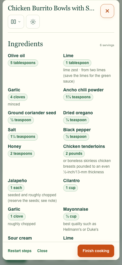
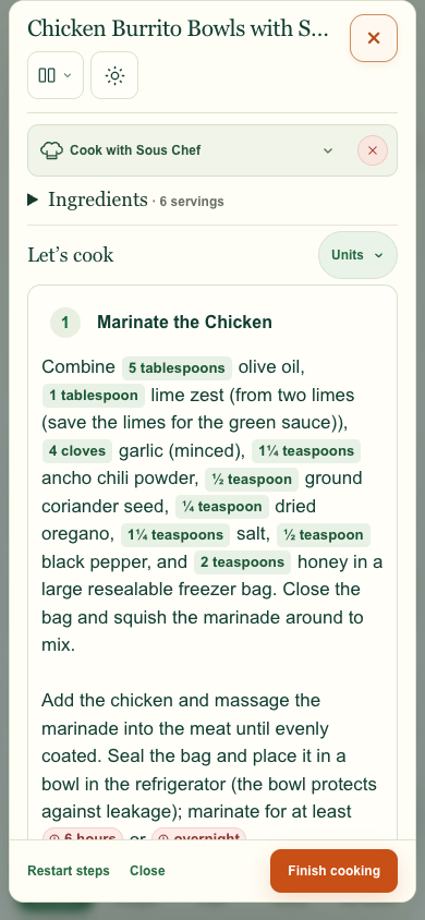
In the 21-ingredient comparison at 390 px, the panel went from 926 px to 898 px tall.
I asked to put Serve & enjoy on its own line and keep the final step visibly numbered. The serving cue sits beneath the title in the regular Method.
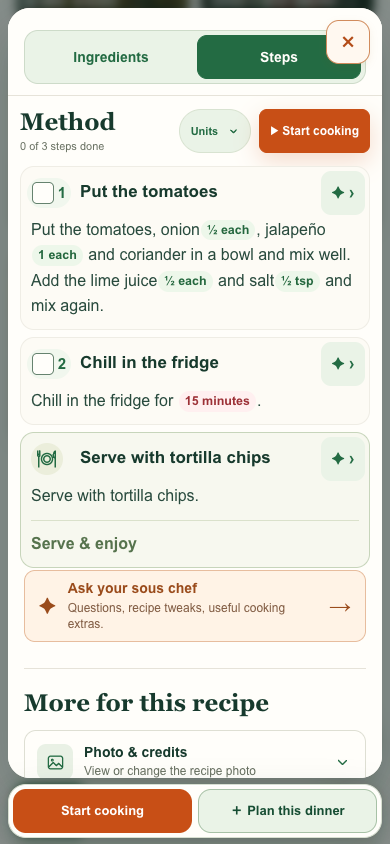
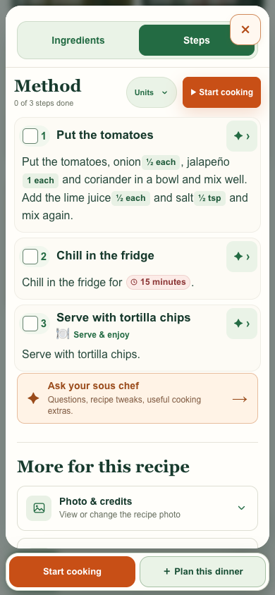
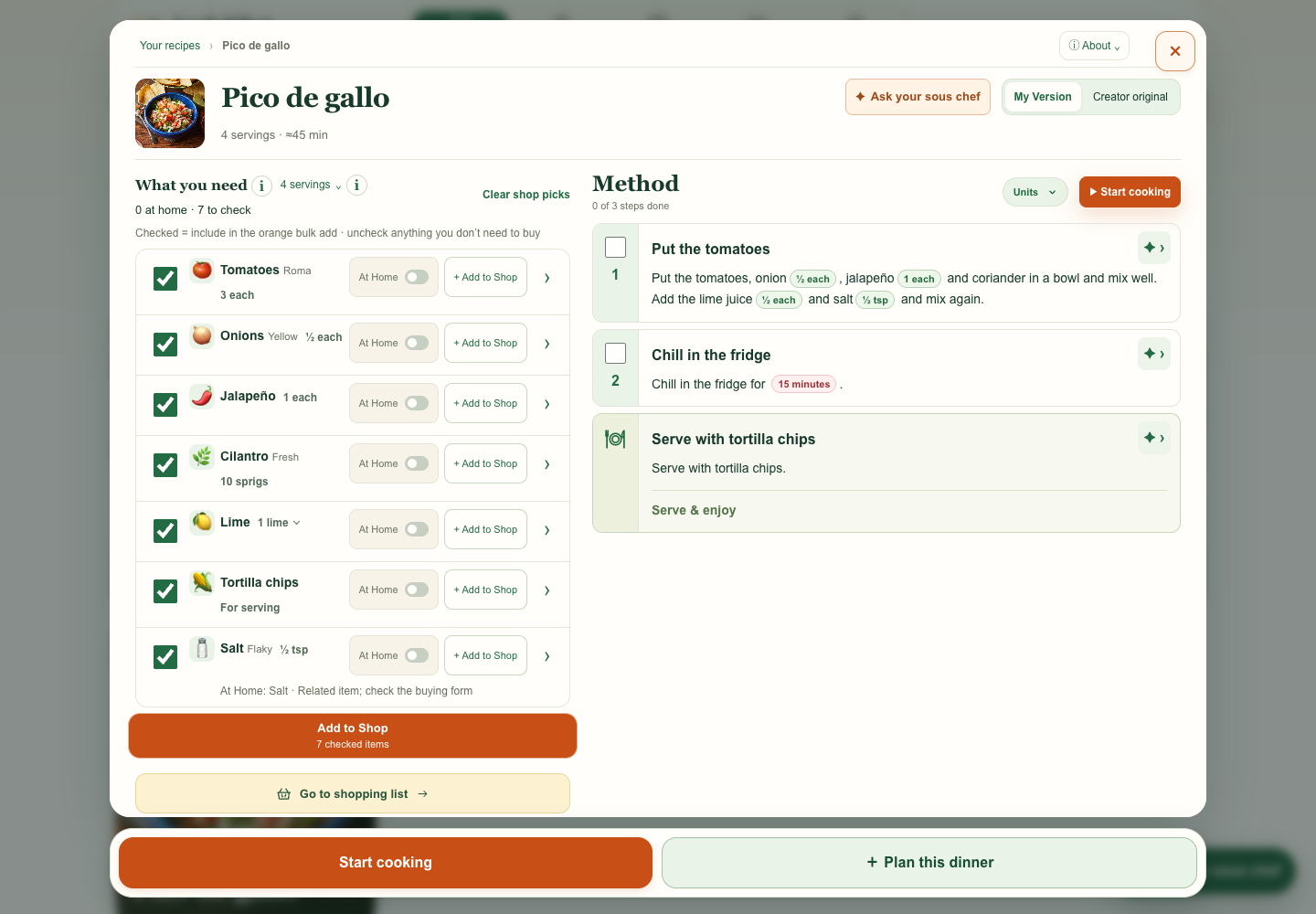
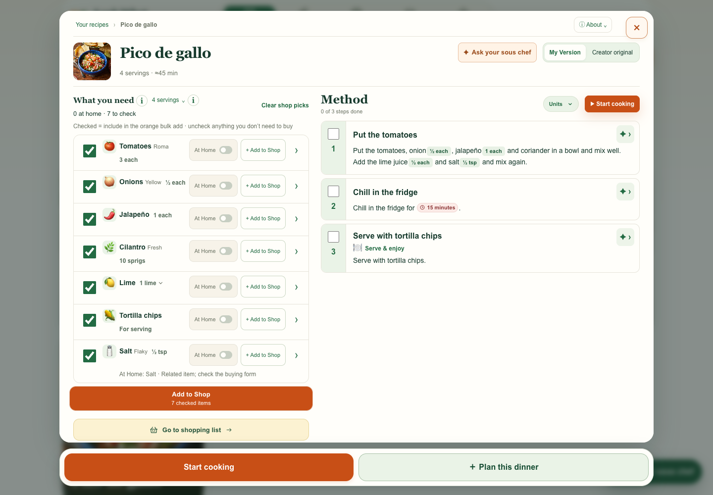
I flagged that the separate serving box looked like a note instead of a step. The preview uses the same card as the other steps, with a numbered step and a plate icon on its own line.
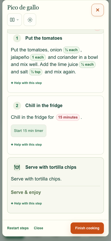
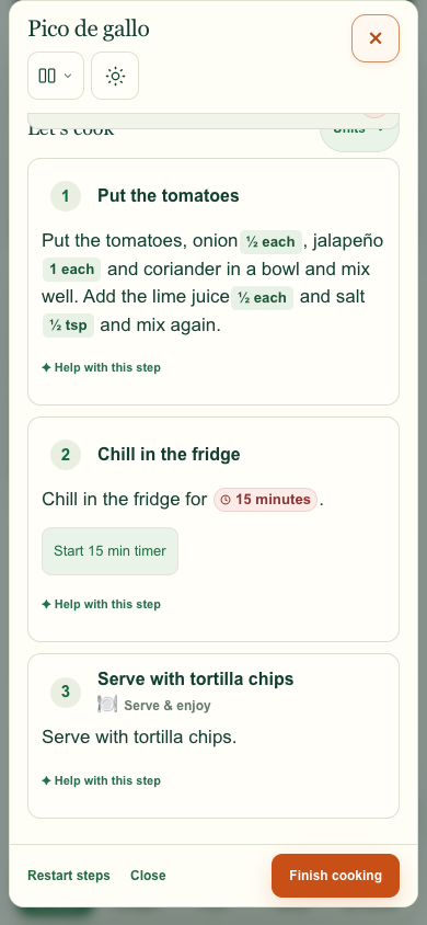
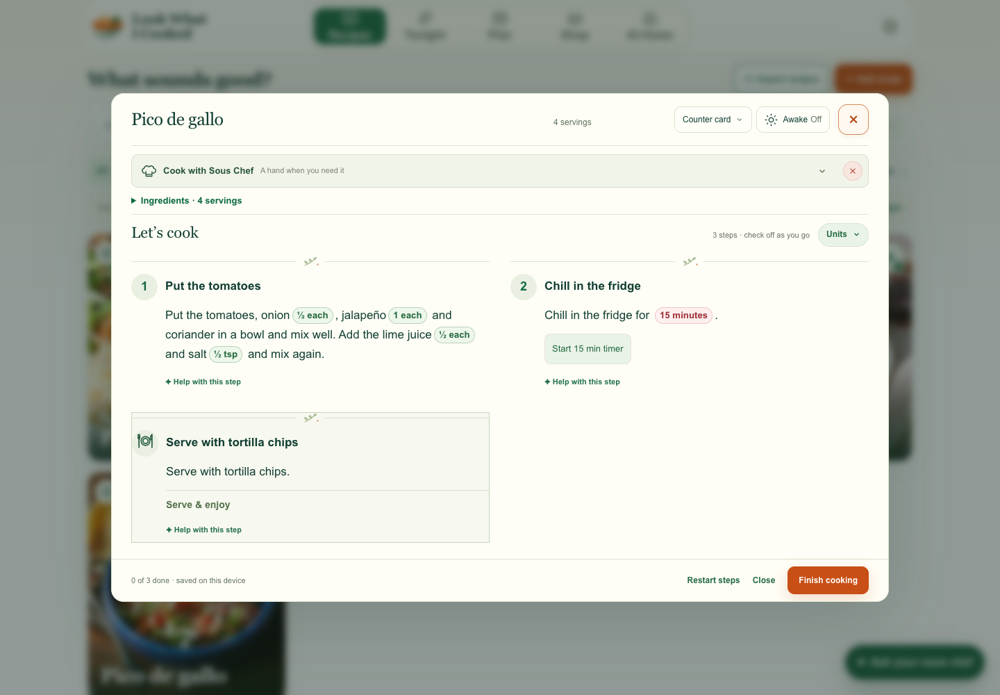
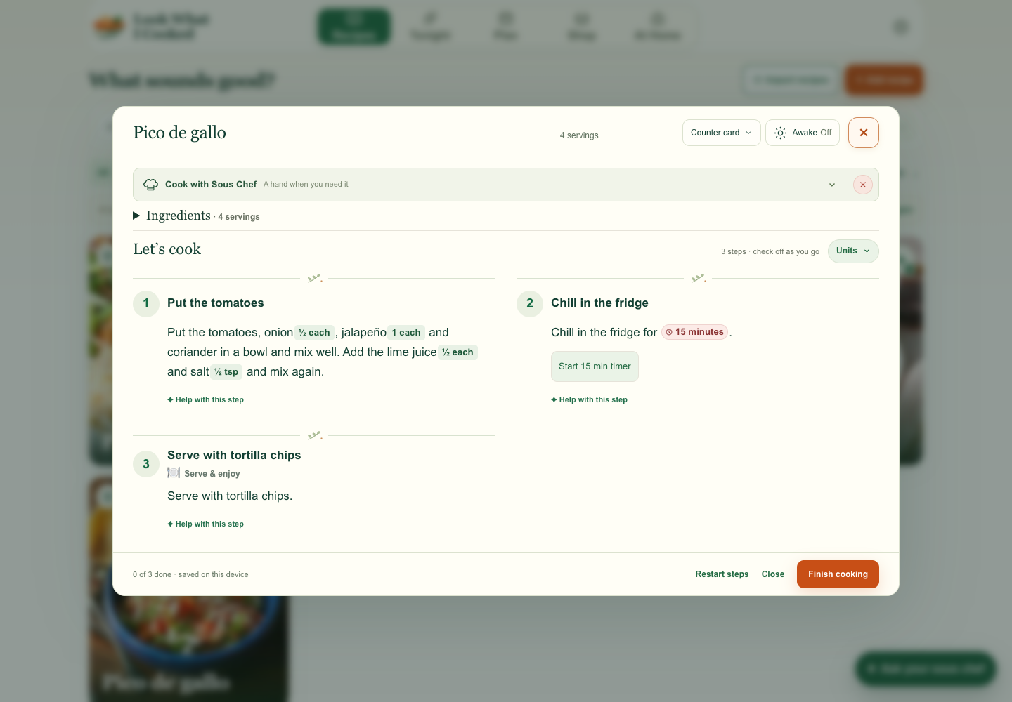
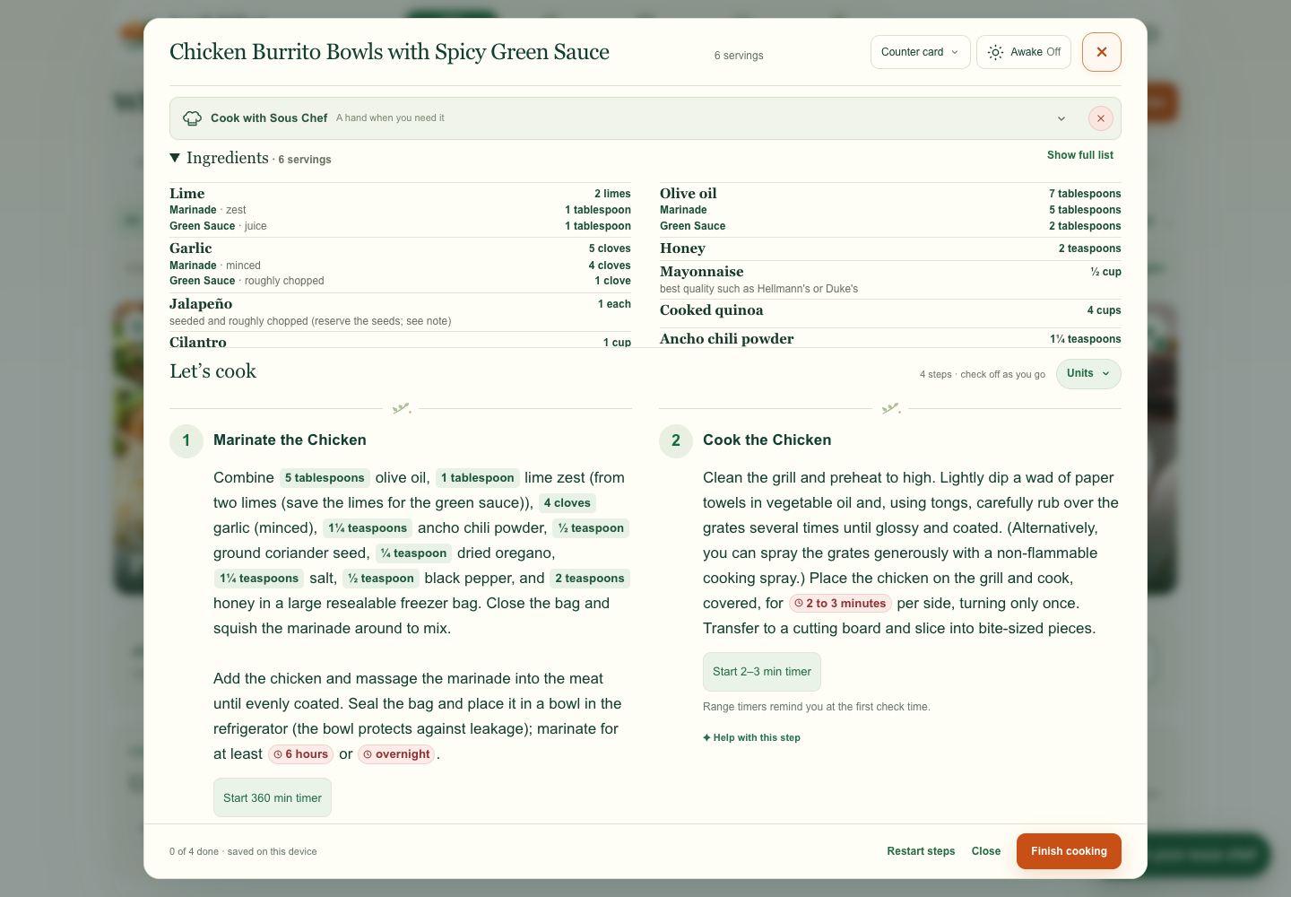
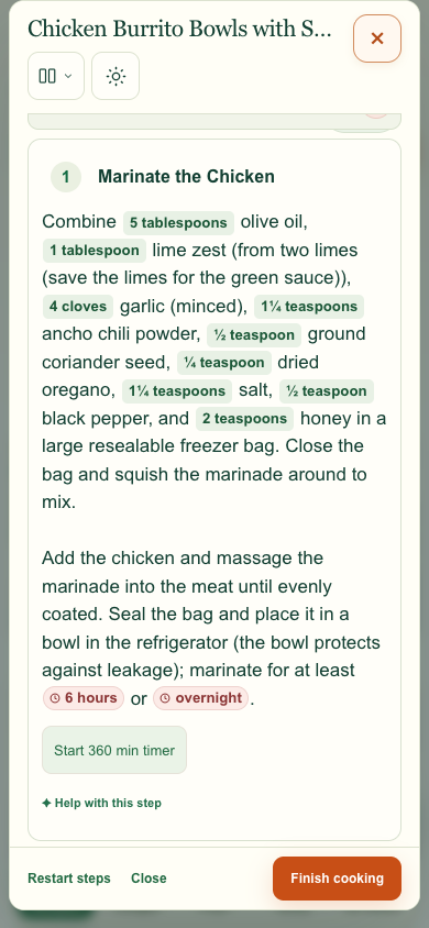
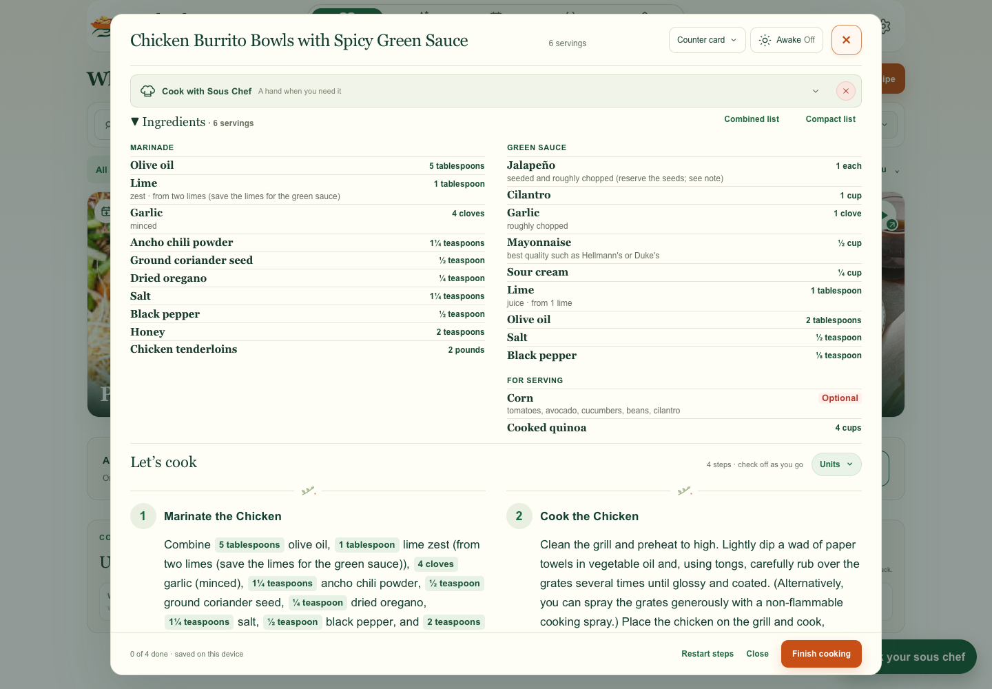
I asked for the same amount and duration styling in Cook mode. The matched instructions make it easy to compare the lighter green amounts and the red clock badges.
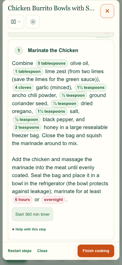
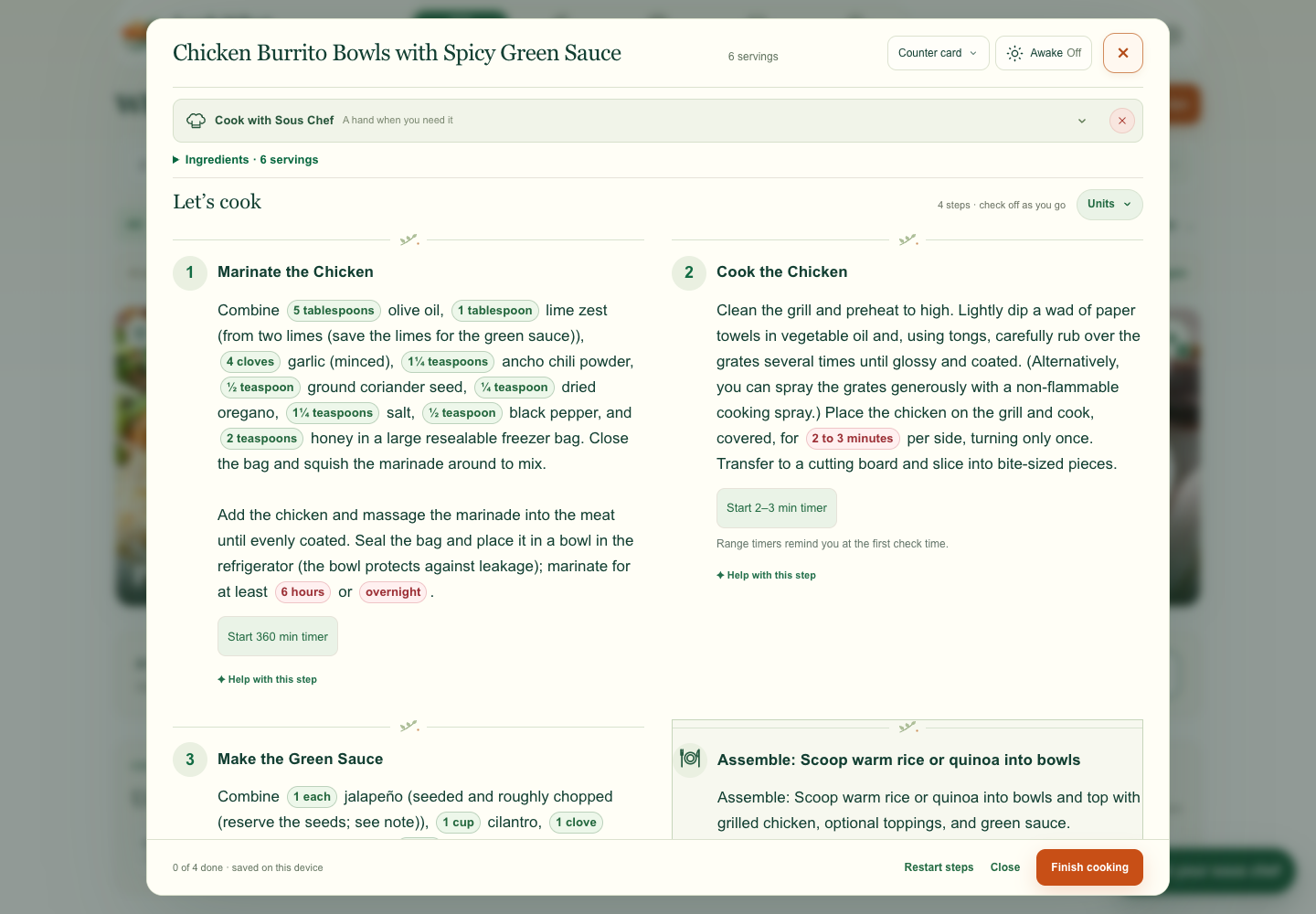
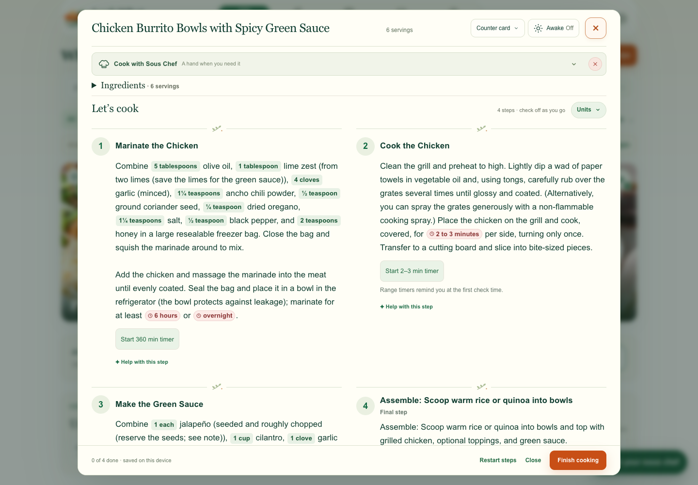
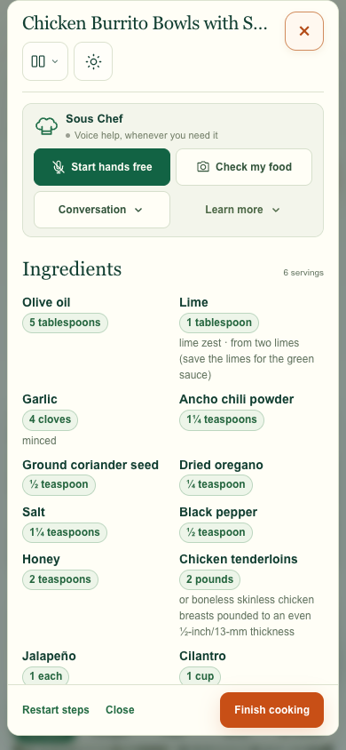
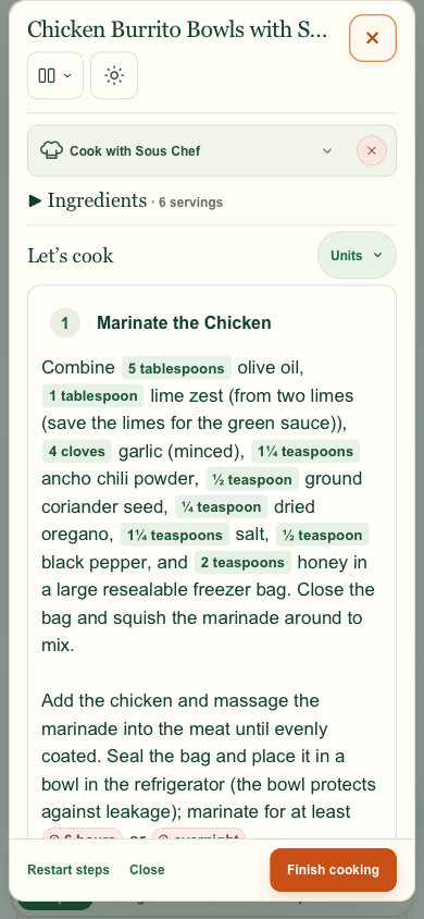
I asked to hide the small X while Sous Chef is expanded to avoid accidental dismissal. I also asked for Learn more to read as a dropdown beside Conversation. The captures show both open and closed states.
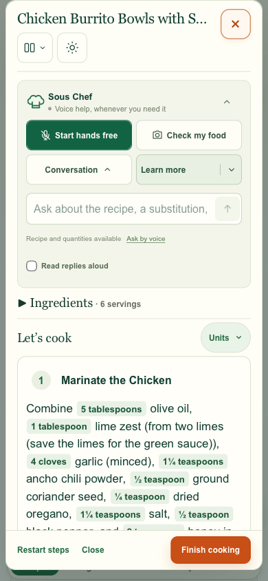
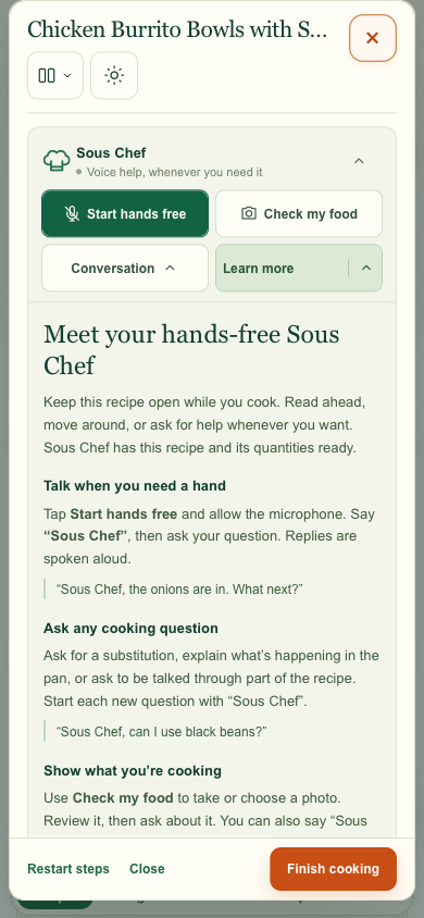
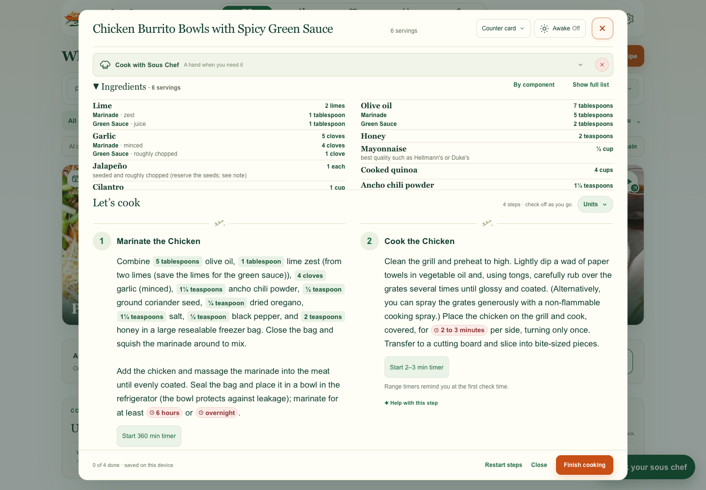
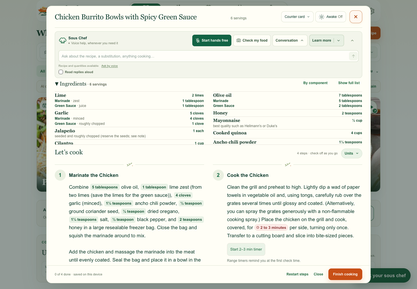
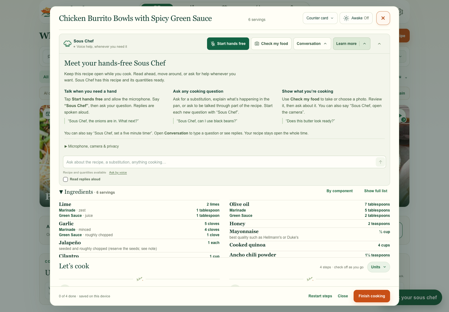
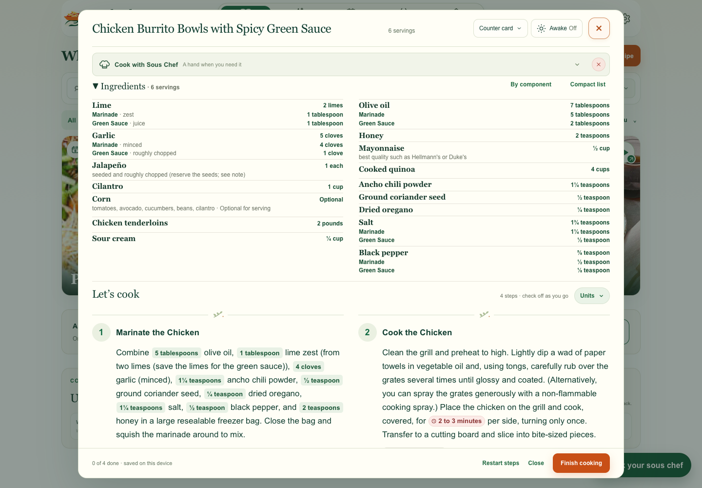
I spotted repeated rows for Lime, Garlic, and Olive oil and asked for one row per ingredient, with each use underneath. The same recipe went from 21 rows to 16.
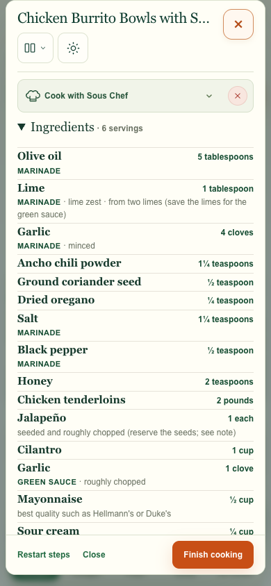
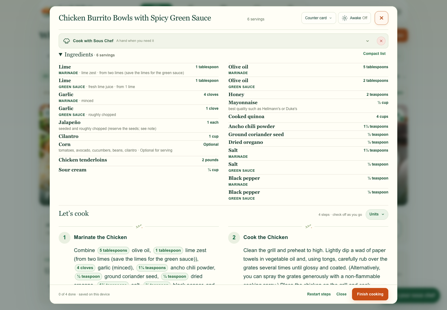
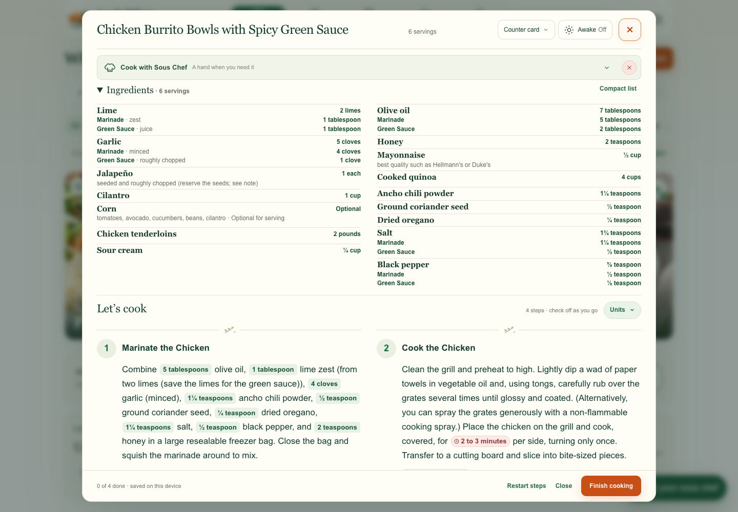
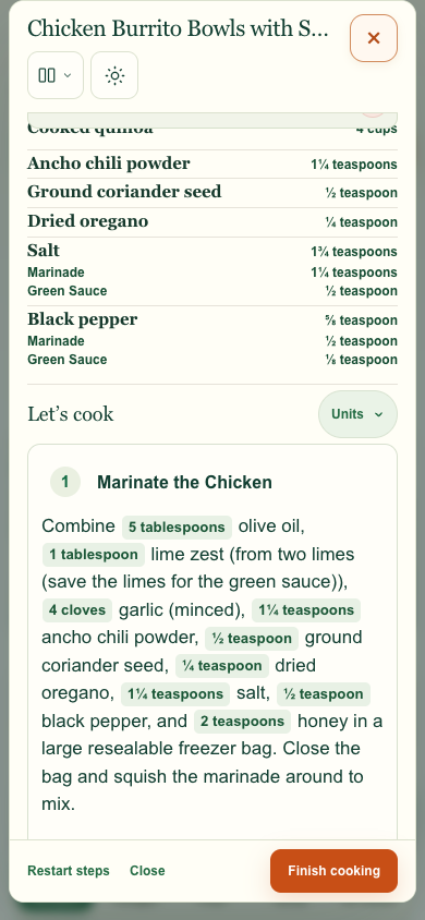
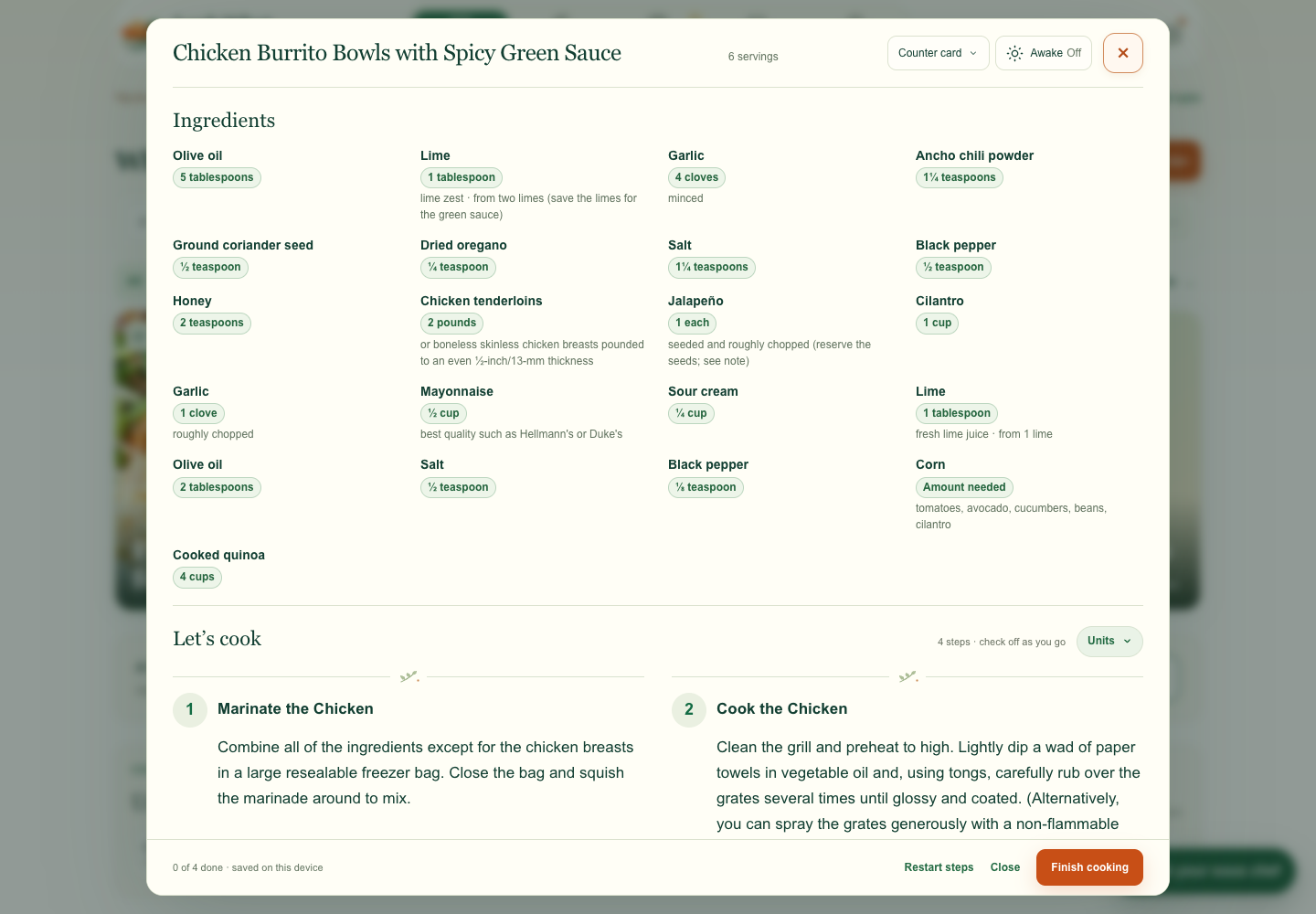
I proposed a By component view for cooks who want to prep the marinade and sauce separately. It uses the recipe’s stated split and keeps amounts like “5 cloves, divided” when the source gives no breakdown.
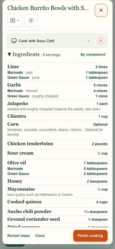
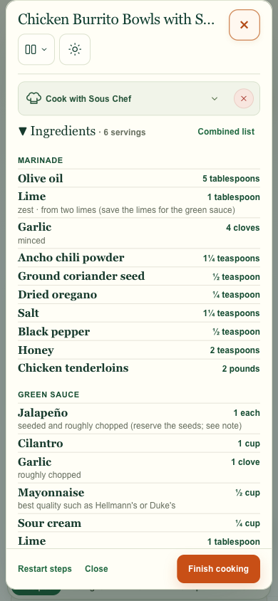
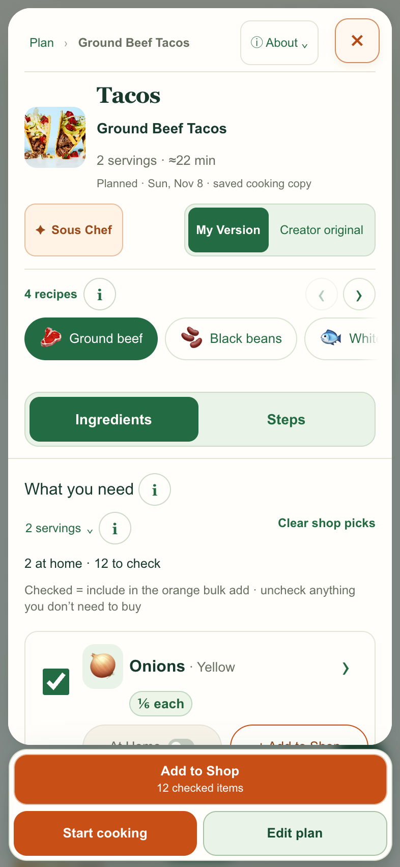
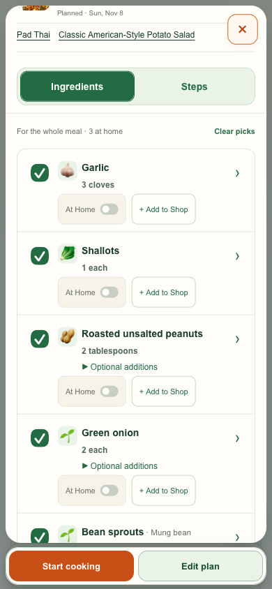
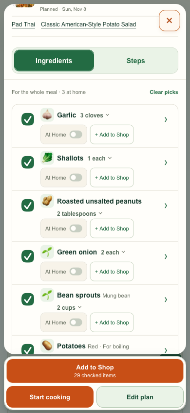
I noticed the mobile Plan preview was missing Add to Shop. The updated Ingredients tab puts the checked-item action back in the footer for the combined dinner.
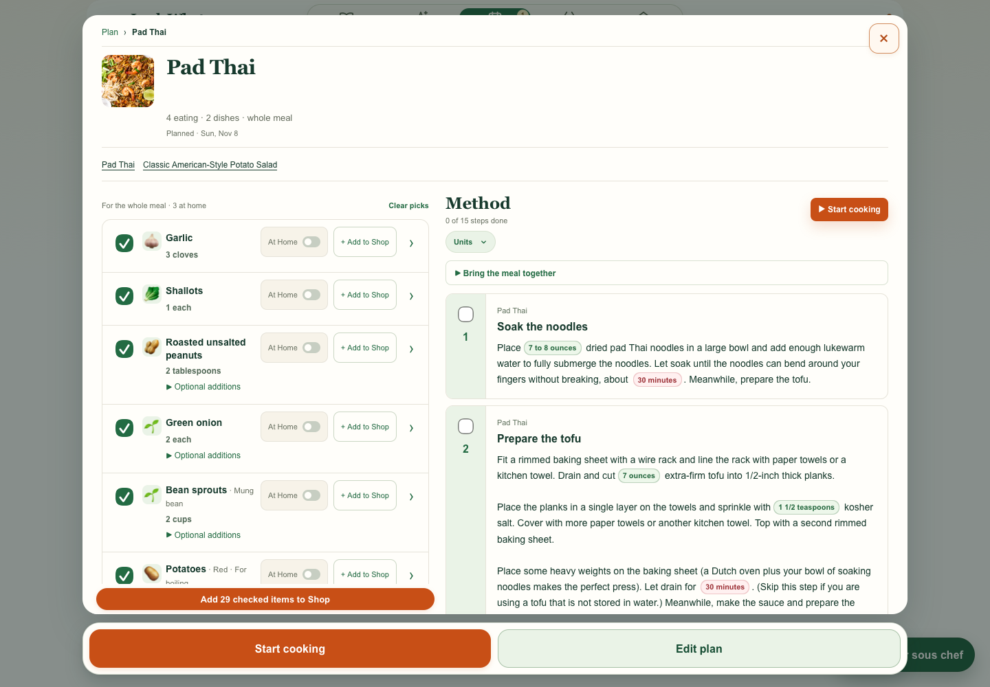
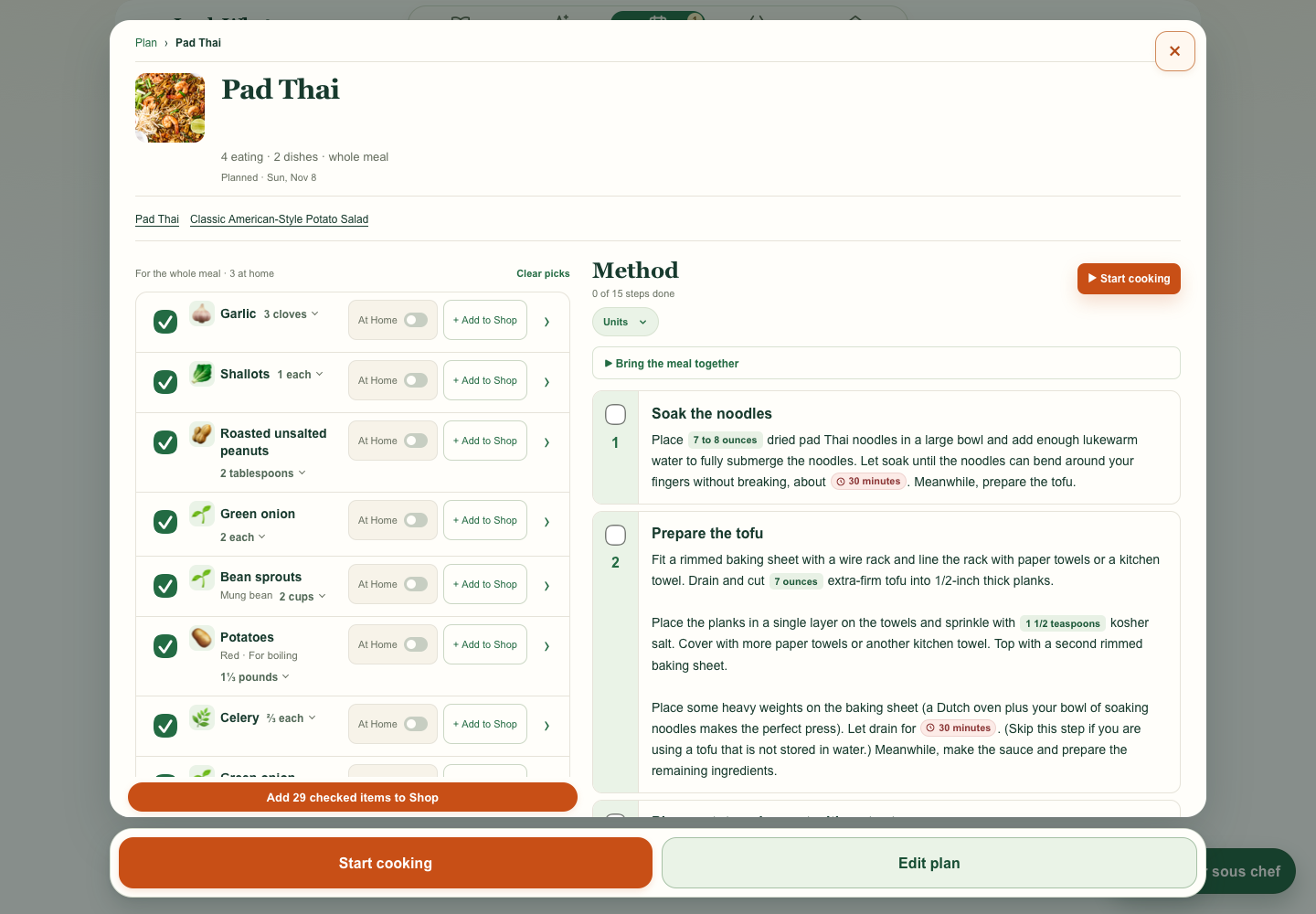
I flagged the repeated “Pad Thai for dinner” label above each step. The preview leads with the step title so the actual instructions are easier to scan.
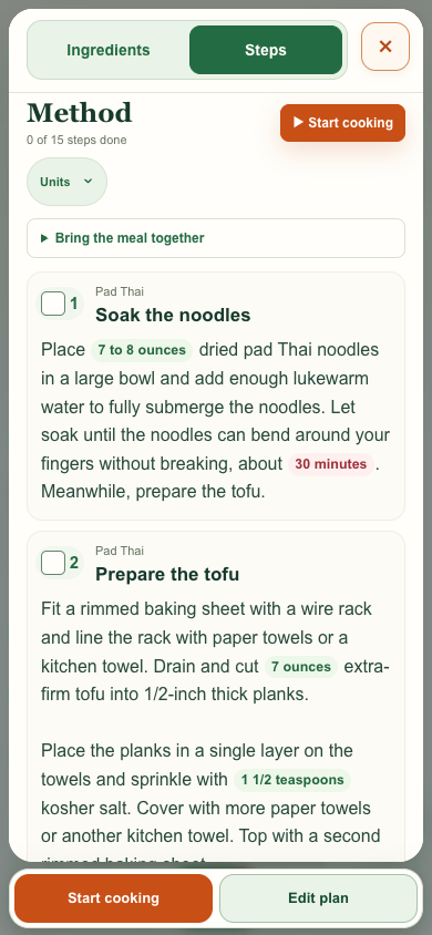
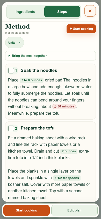
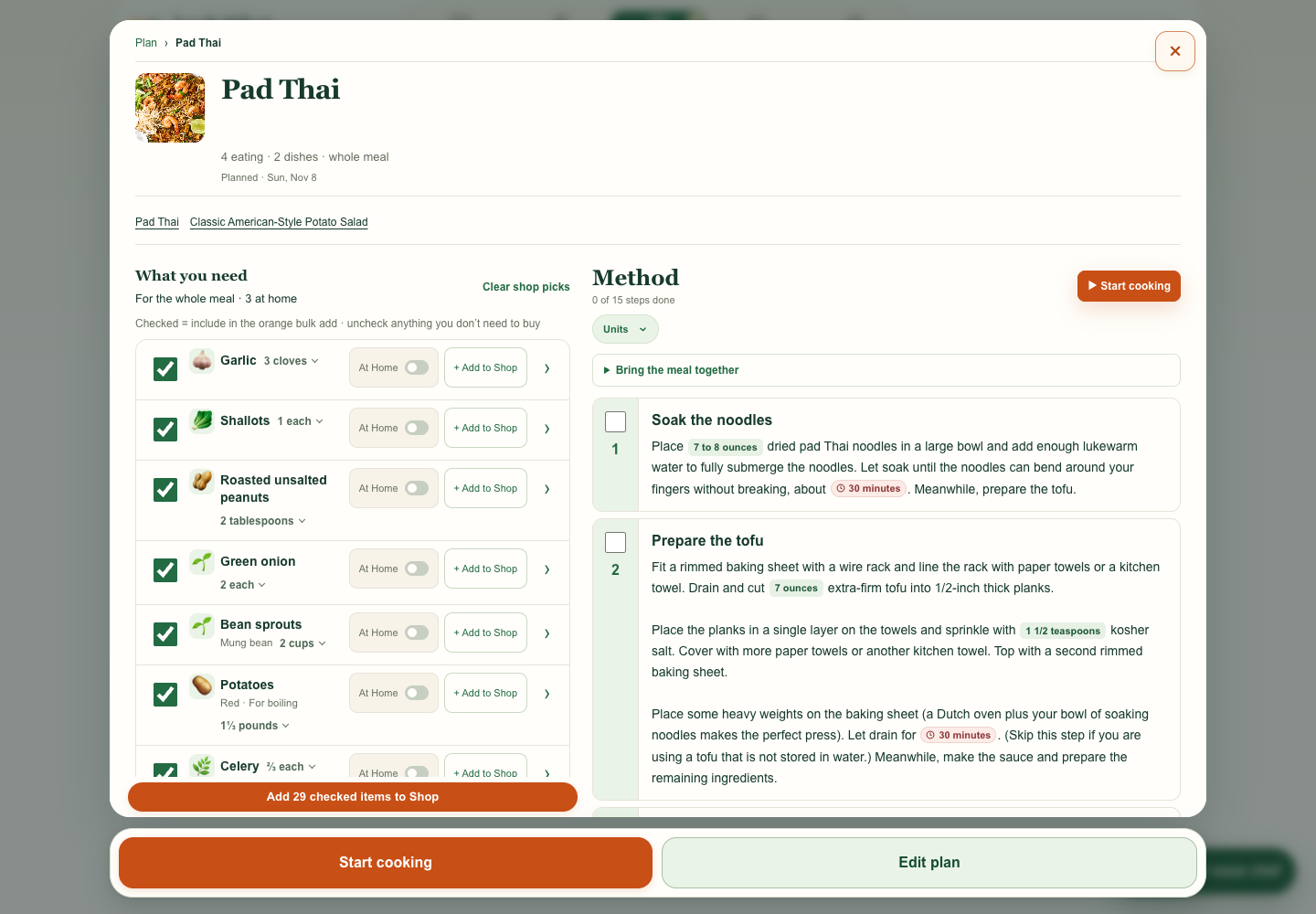
Plan · Design preview
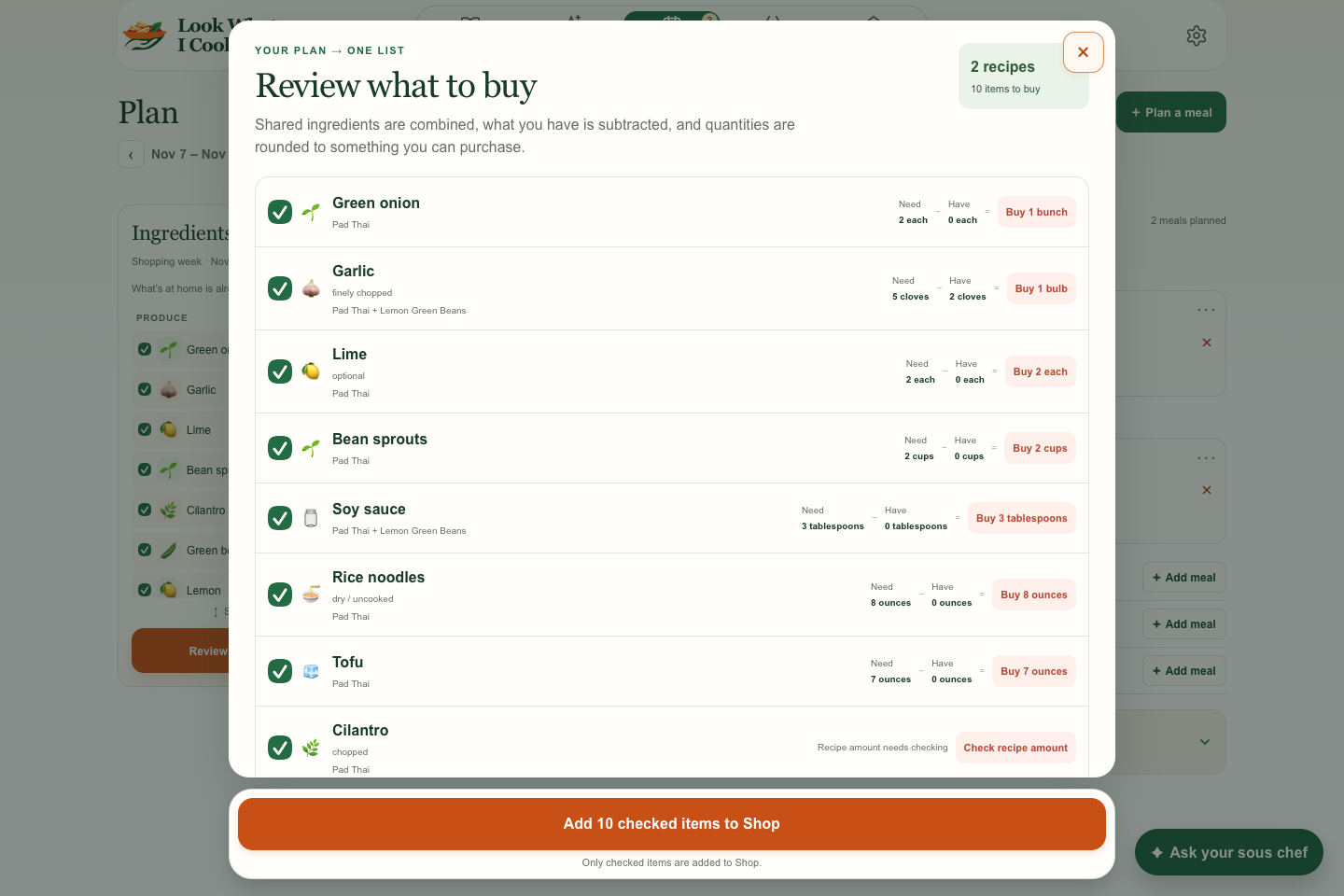
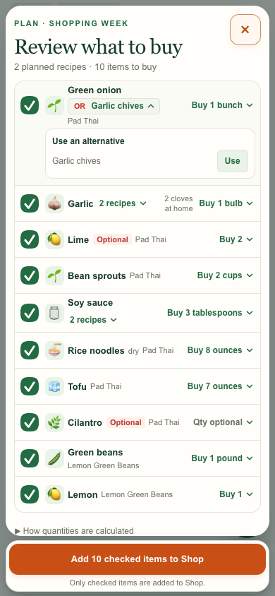
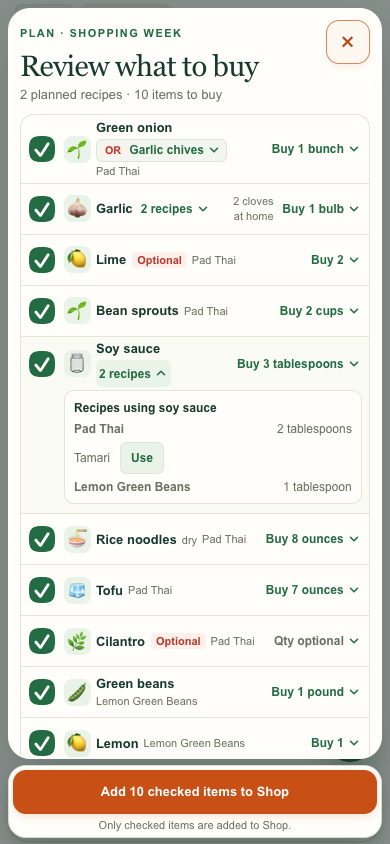
My request Keep ingredients easy to scan while showing which meals need them and how much to buy. Group the ingredient, Optional badge, substitute, and recipe on the left. Keep what’s at home next to Buy on the right.
What changed The desktop checklist fits on one line per item. Recipes and Buy open the same panel, pairing the amounts from each recipe with the shopping summary. OR has a separate chooser. Optional appears on the main row only when every use is optional.
Both sides use the same two sample meals and 10 shopping items. The after images show an isolated preview.
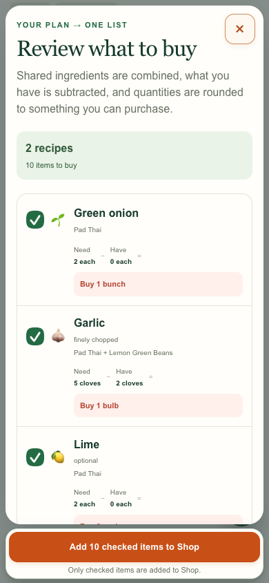
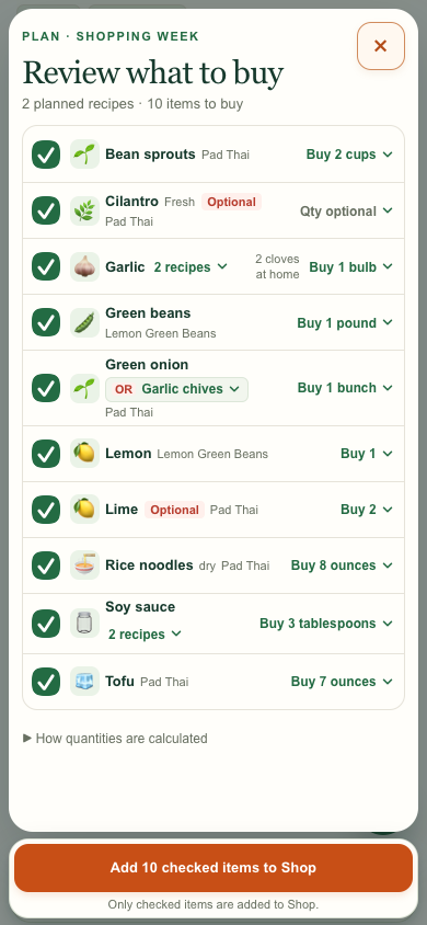
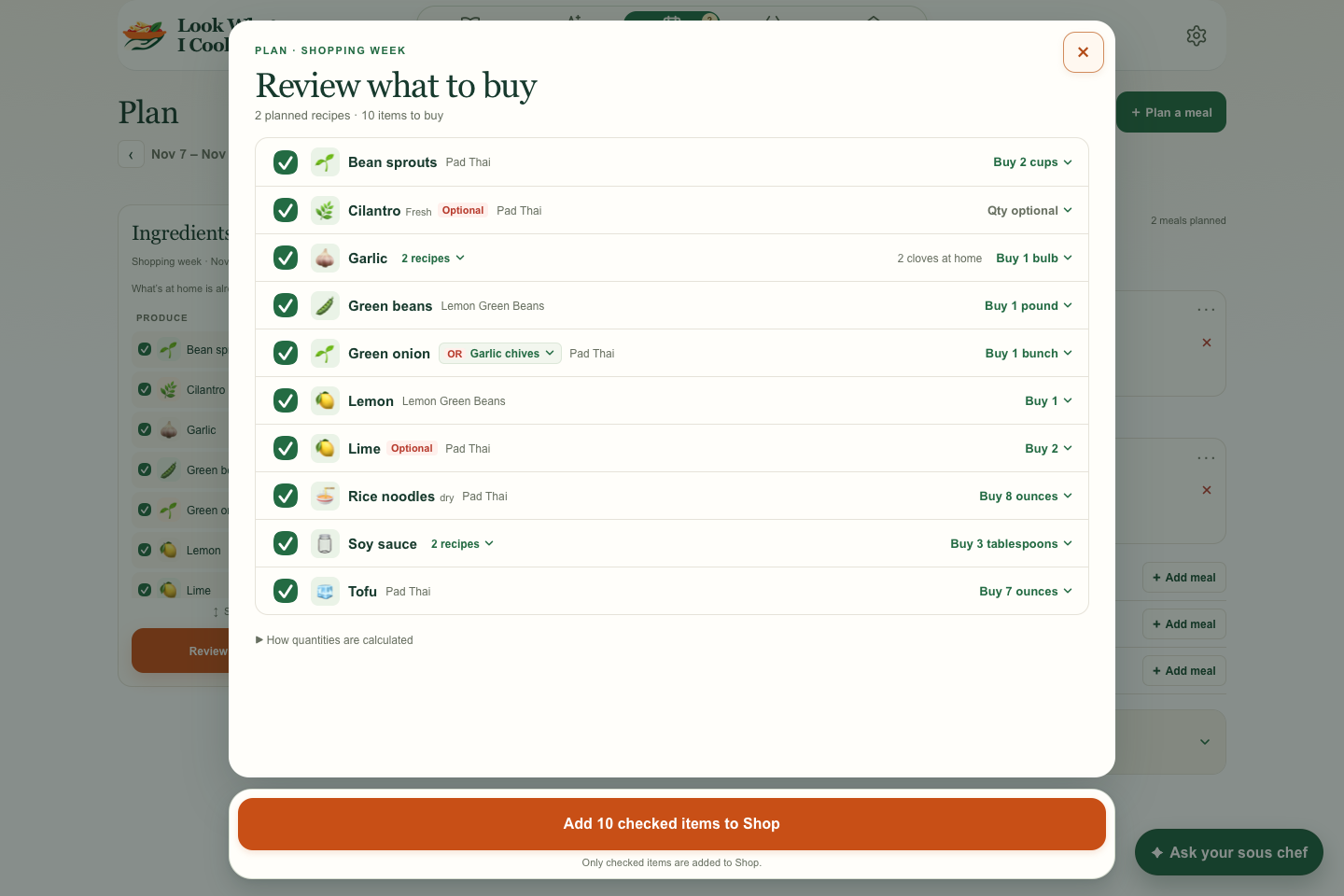
On desktop, the panel is centered with two columns. On mobile, the two sections stack.
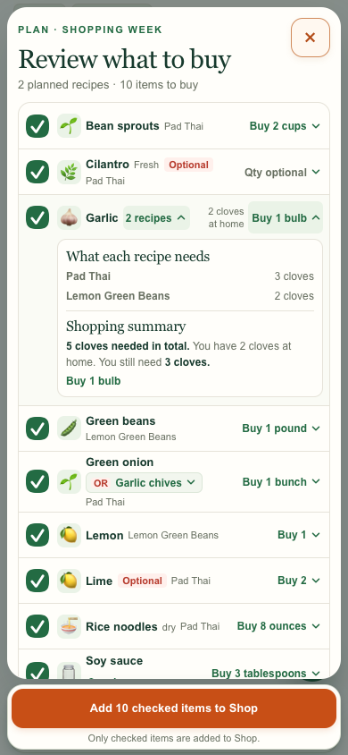
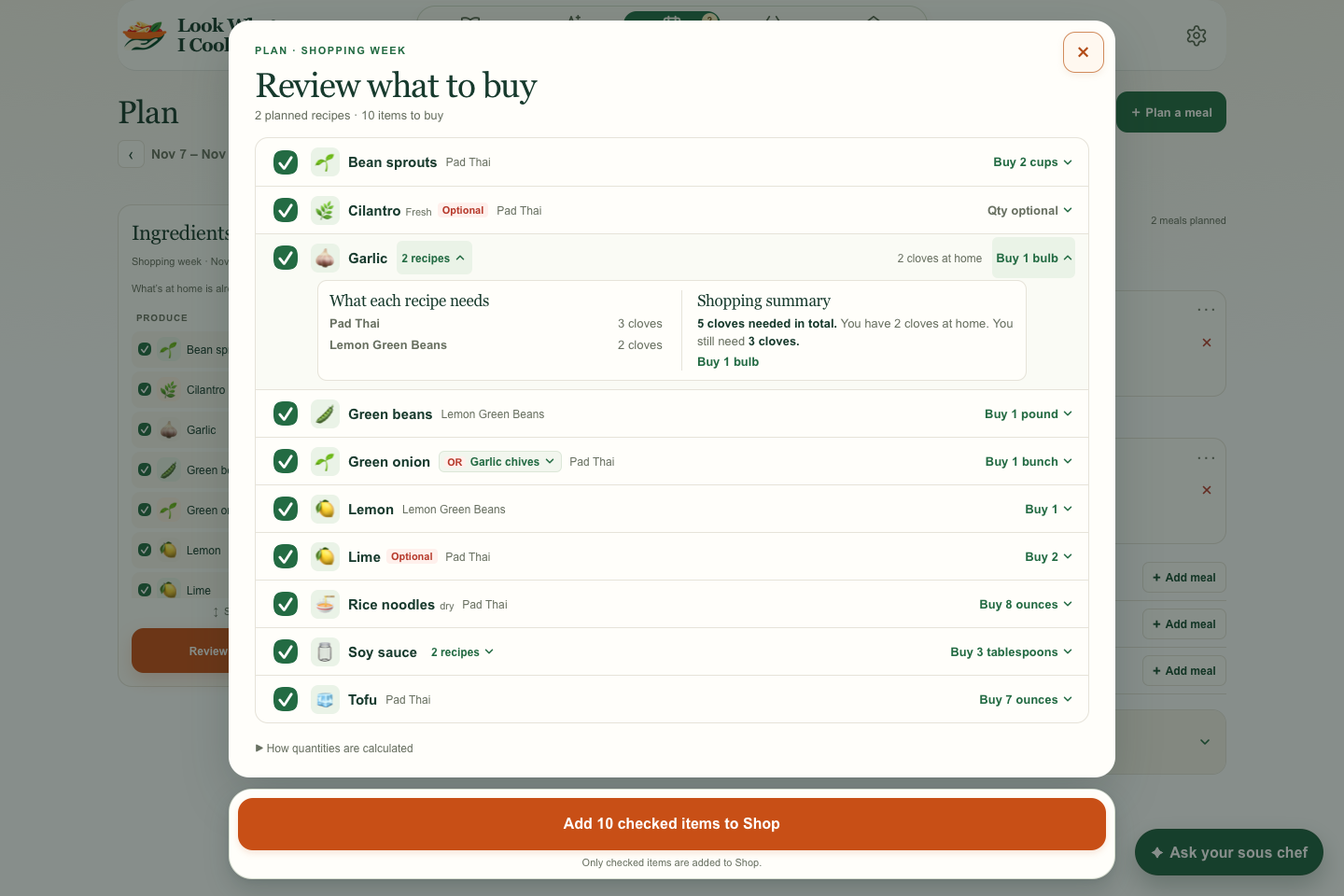
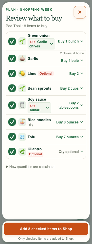
Garlic chives can replace green onion in the row. Tamari appears under Pad Thai because that’s the recipe that offers it.
When the week has one recipe, its name appears once in the header. Optional stays beside the ingredient.
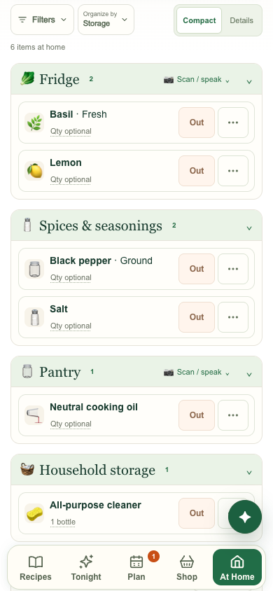
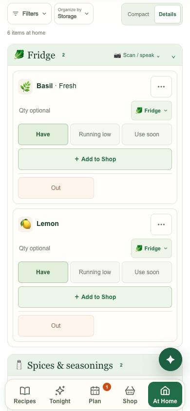
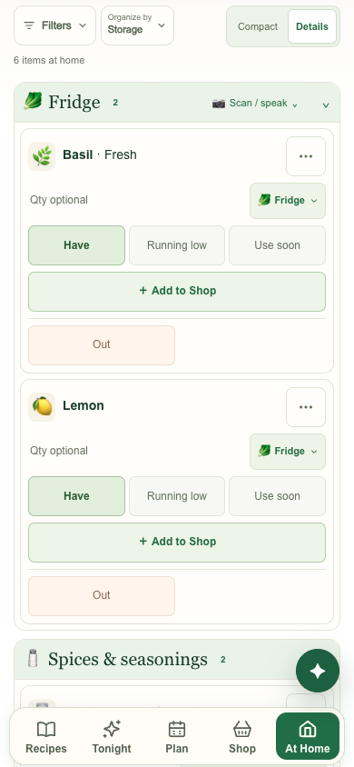
I asked for more of the pantry list to fit on mobile and a lighter spacing change on desktop. The captures use the same six items so the density change is easy to compare.
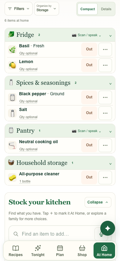
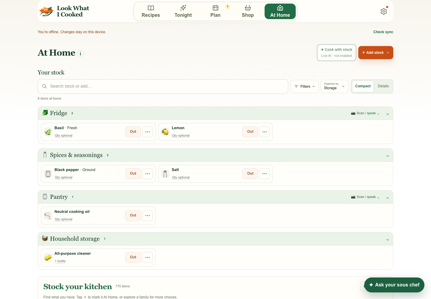
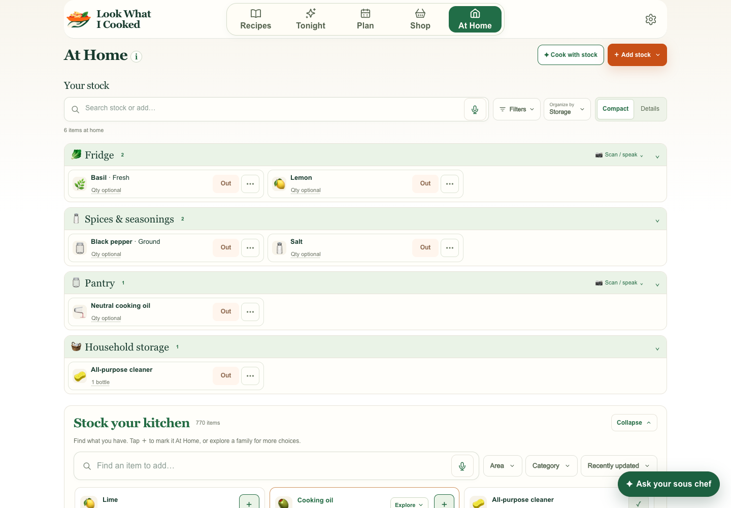
I kept Details in the review so the compact layout could be compared with the same six items when more information is needed.
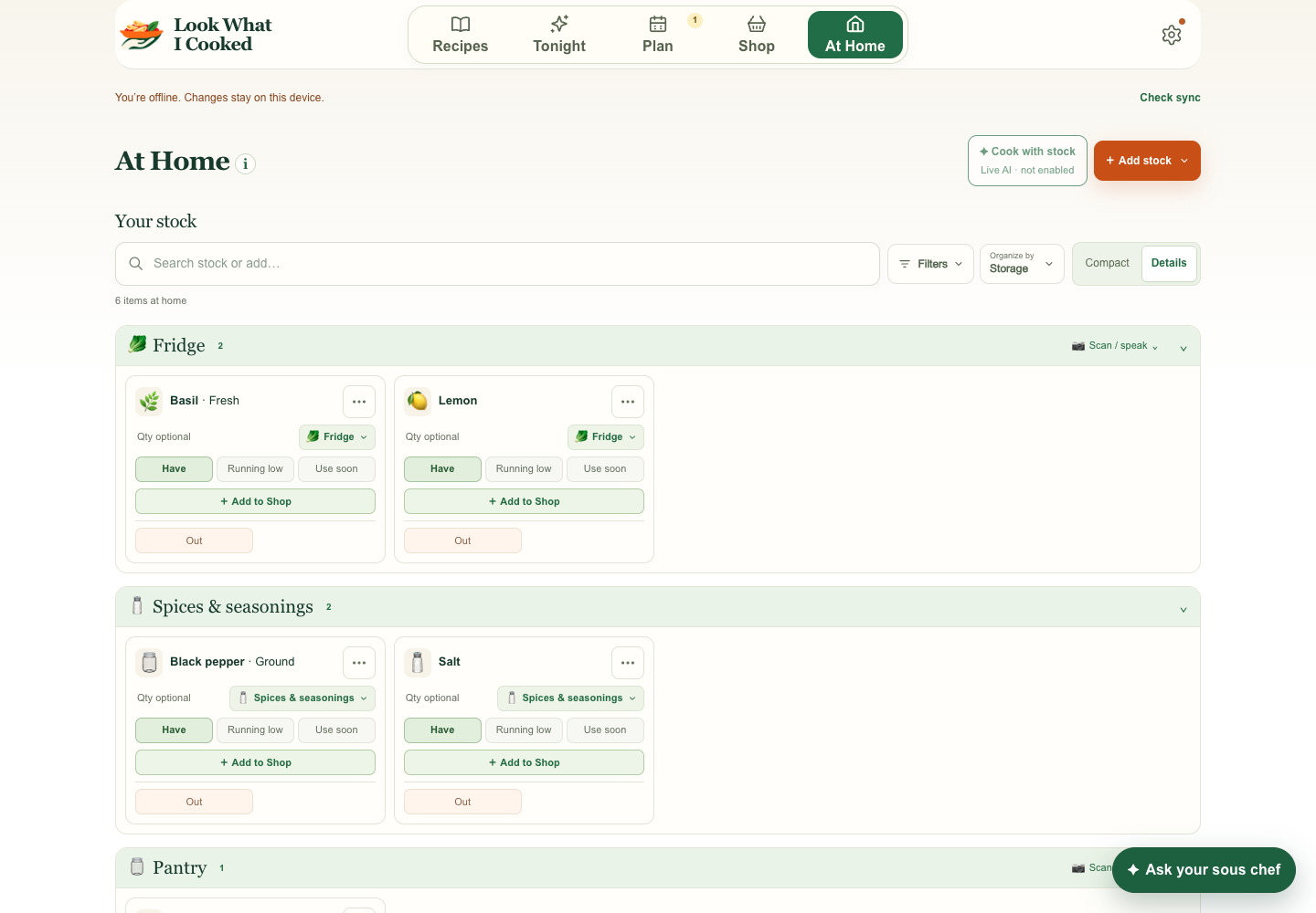
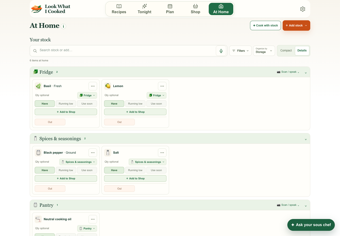
I flagged “Check amount” on citrus when the recipe already said how many fruits it used. The shopping row shows whole fruit, while the expanded recipe uses keep the measured juice and zest.
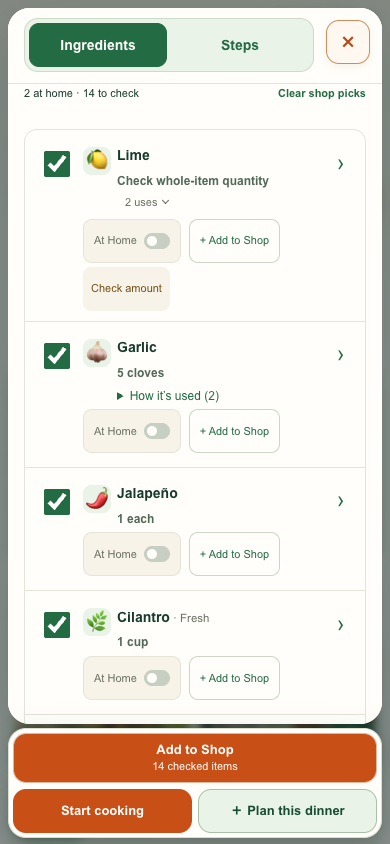
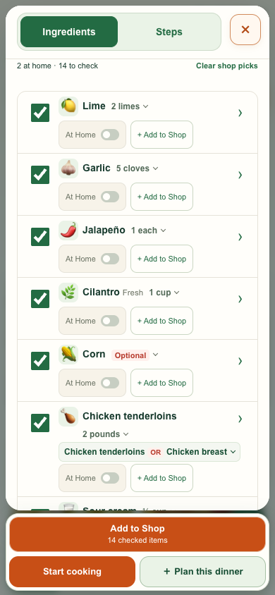
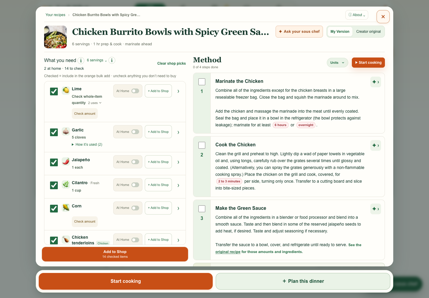
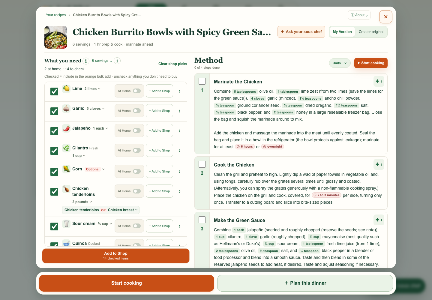
I flagged text spilling out of the Shop toolbar on a narrow phone. This comparison also follows the same lime into Shop to check that the whole-item count carries through.
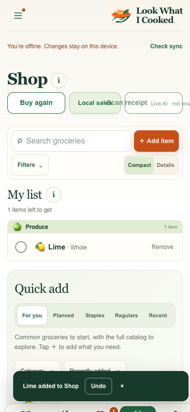
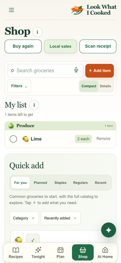
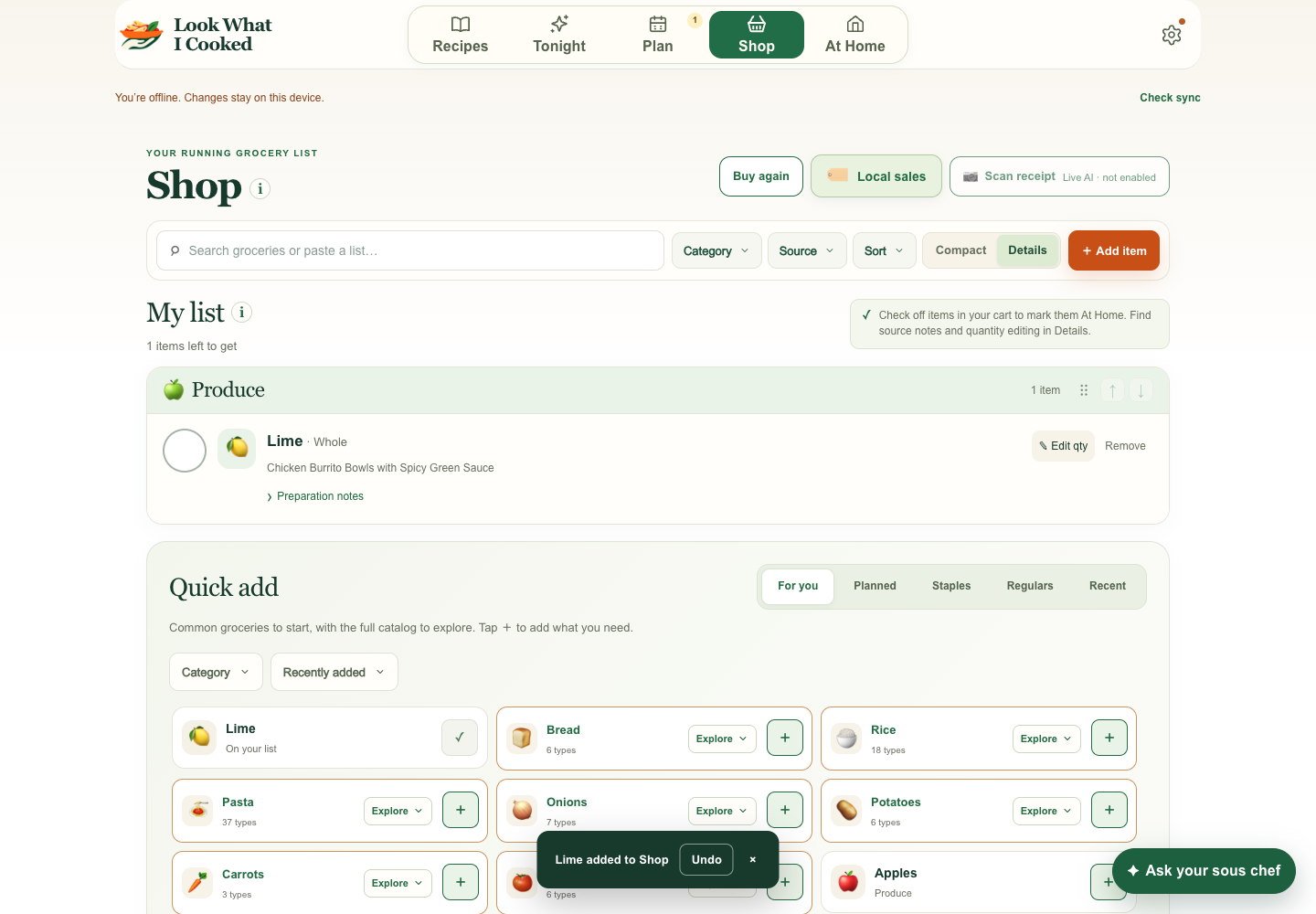
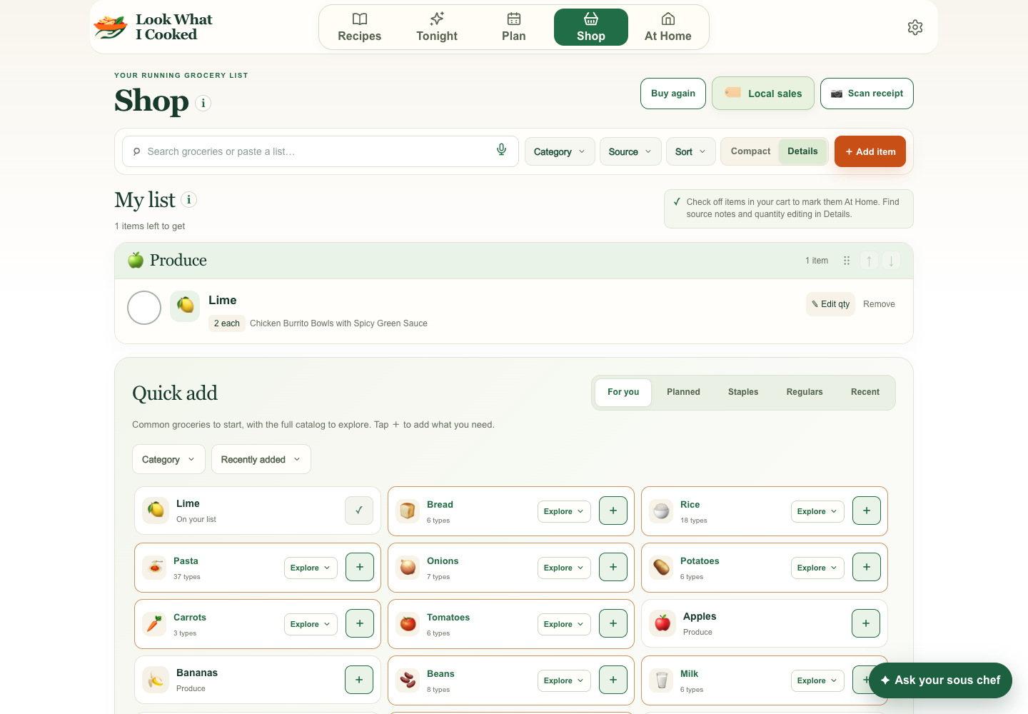
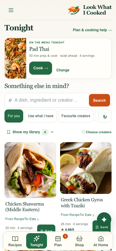
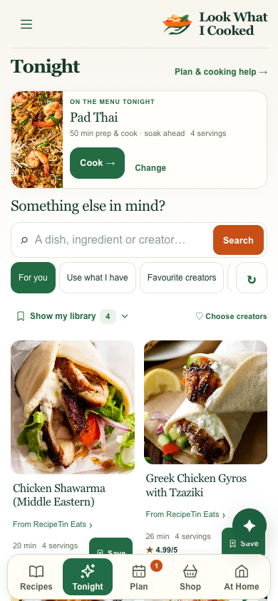
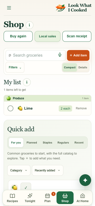
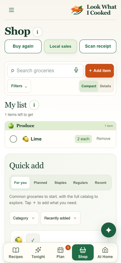
I asked for a brand typography audit beyond the recipe card and requested before-and-after evidence of the fixes. The comparisons cover Tonight, Recipes, and Shop.
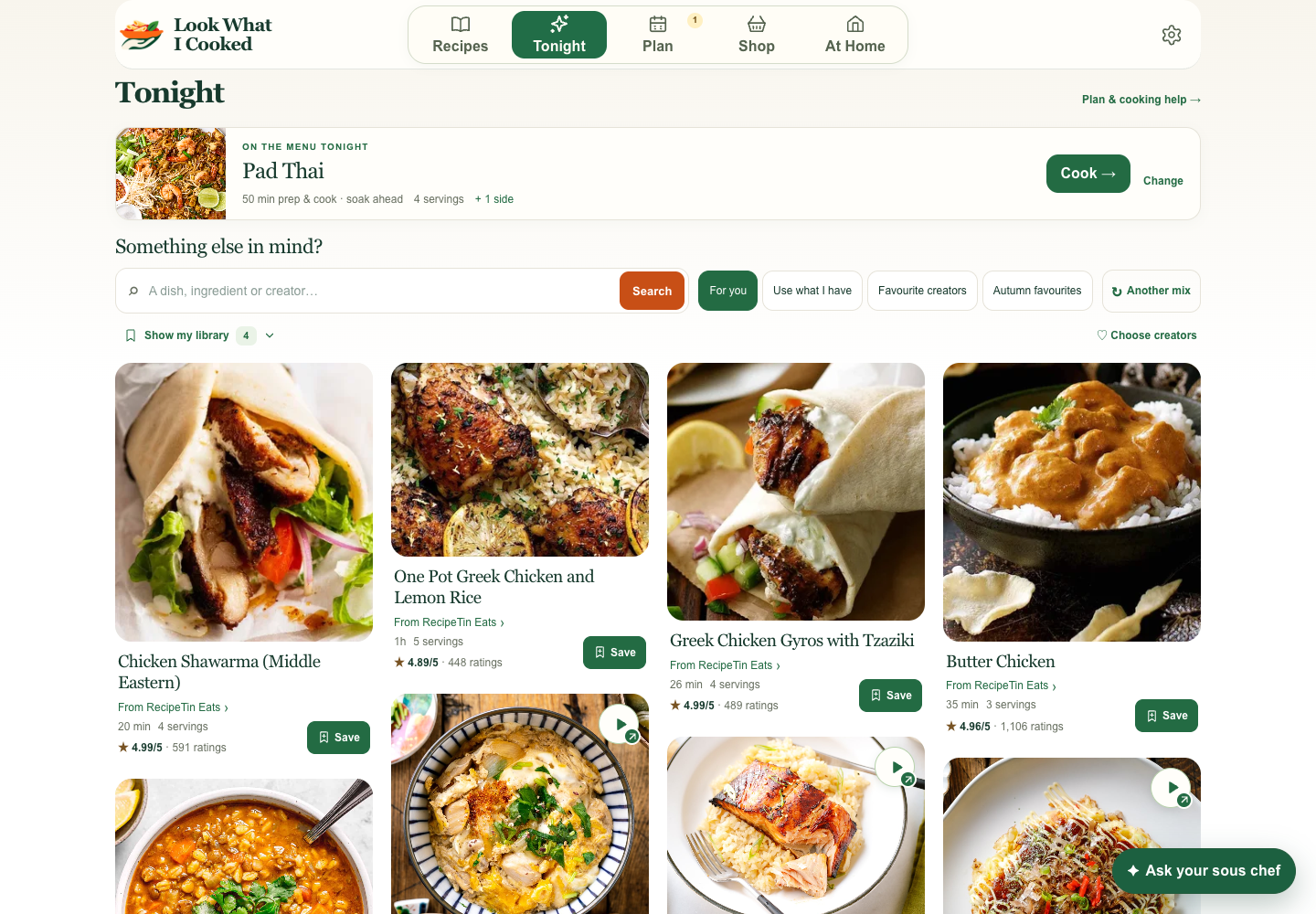
Planned and suggested recipe titles use the same Georgia typeface as the Recipes library.
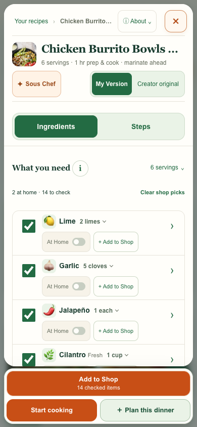
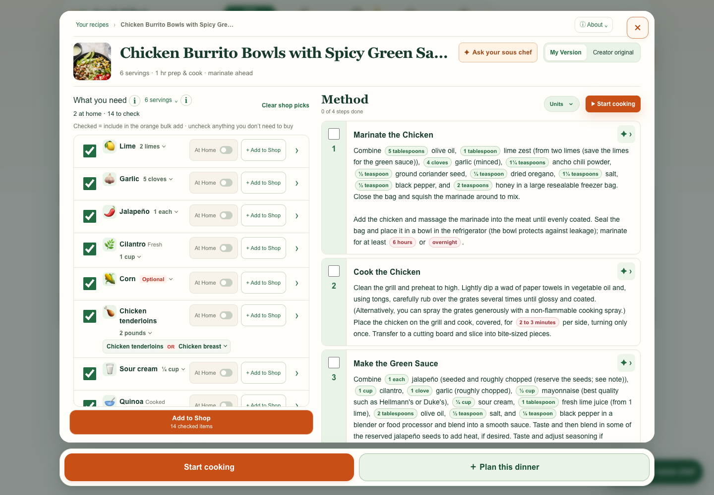
The What you need heading uses Georgia, matching the Method heading beside it on desktop.
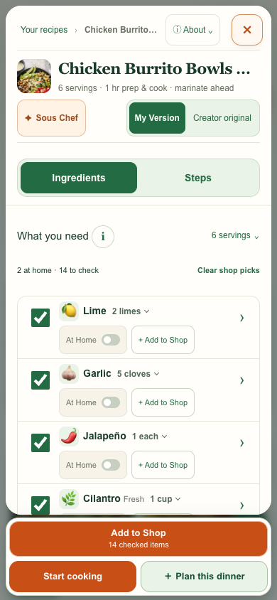
Mobile department headings such as Produce use 14 px Georgia. Desktop already uses Georgia for these headings.
My request I wanted uploads to go straight to my library as soon as the app could read them.
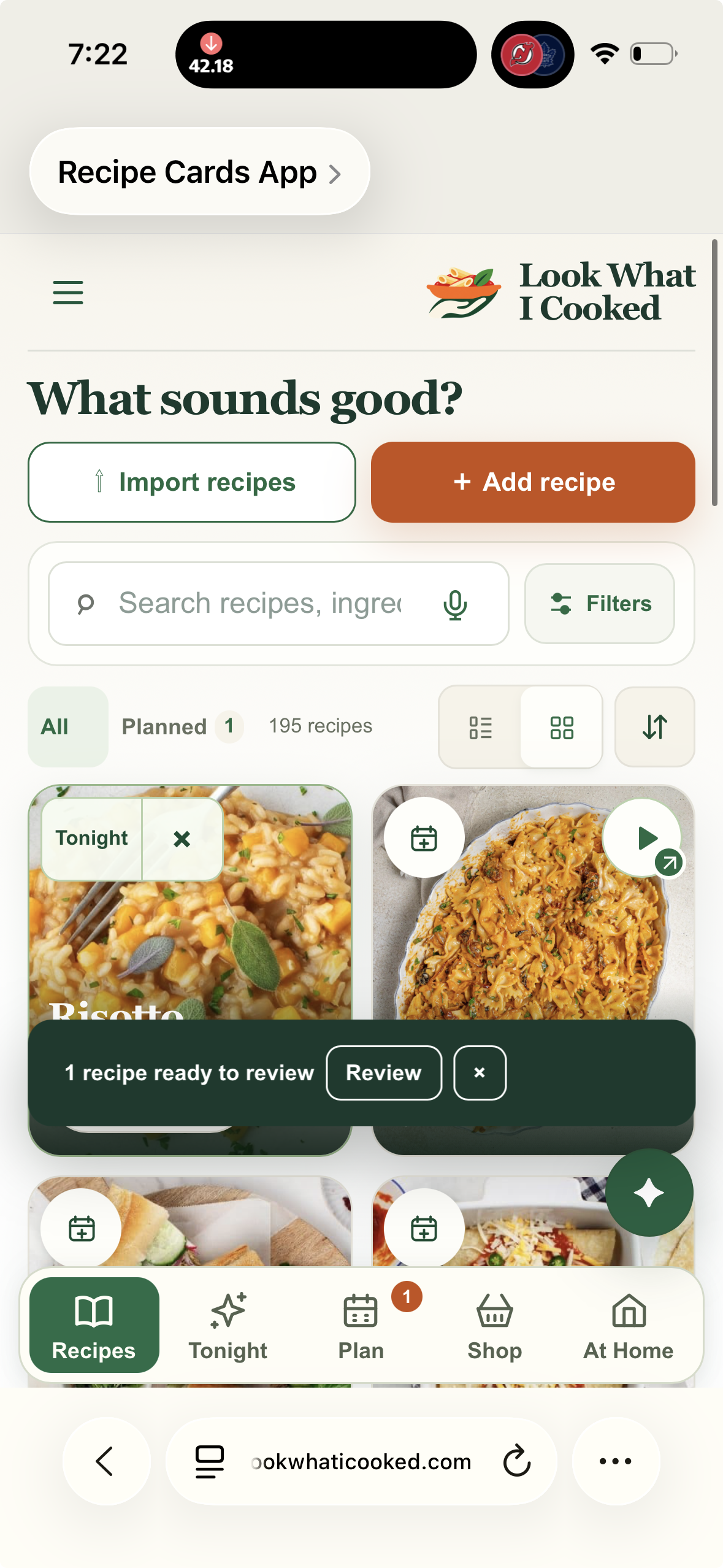
What changed Successful imports save automatically, and unfinished imports are available in Add recipe. Bottom confirmations hide the AI button for five seconds, then it returns.
The before image is the original report. The after images show sample recipes in the release preview.
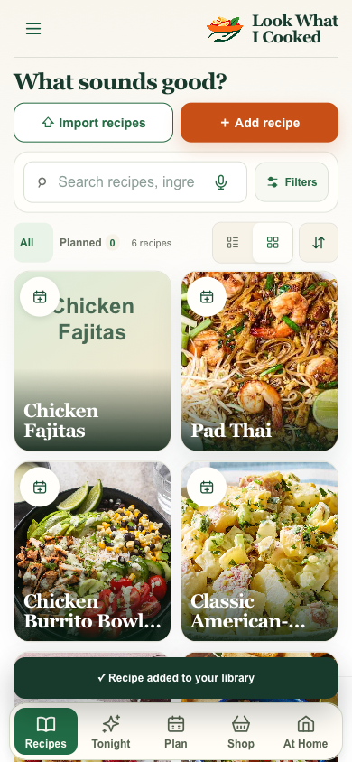
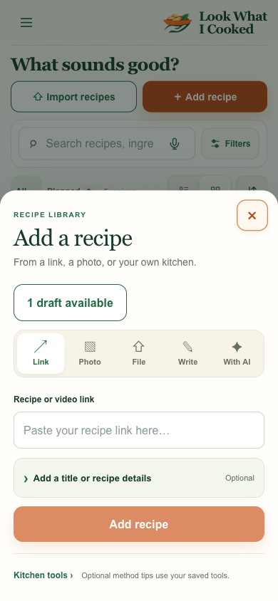
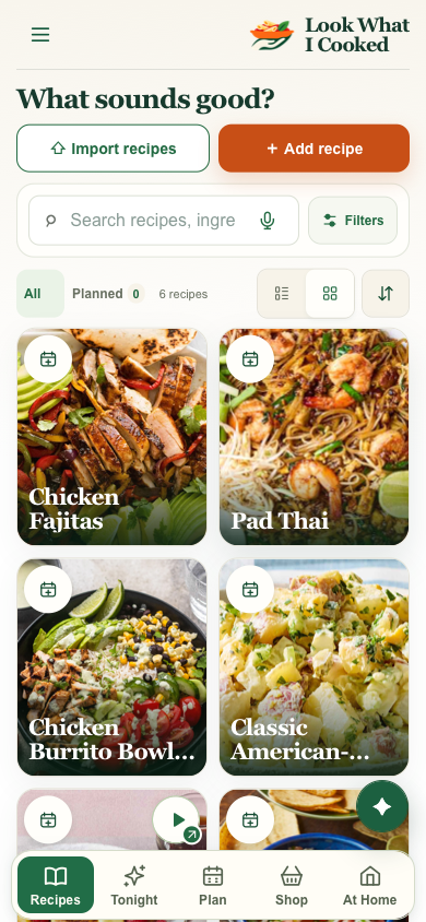
Historical studies from before the desktop ingredient changes were combined.
I asked to see the updated ingredient type in two desktop columns. I flagged that Cilantro felt vertically off beside the amount, so the next comparison centers short rows.
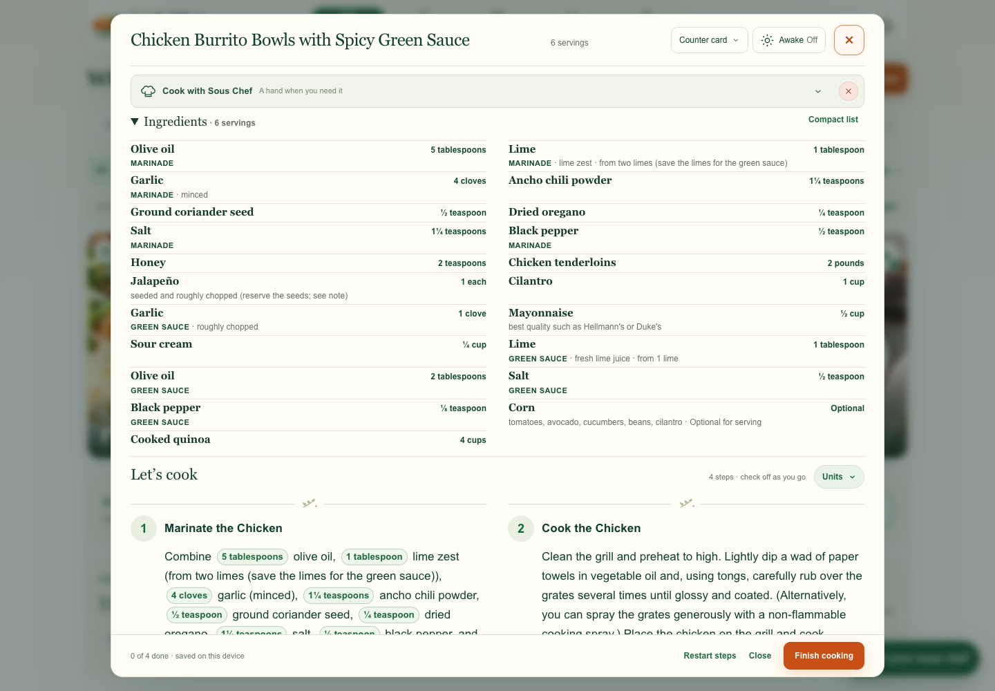
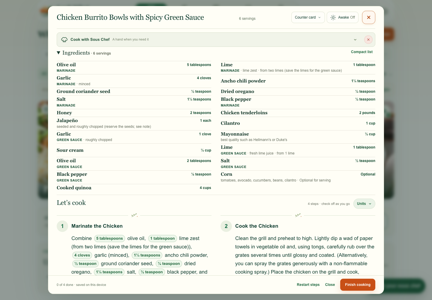
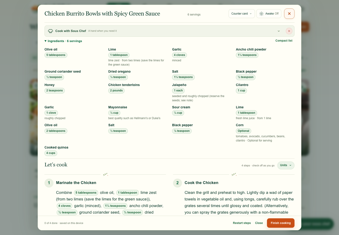
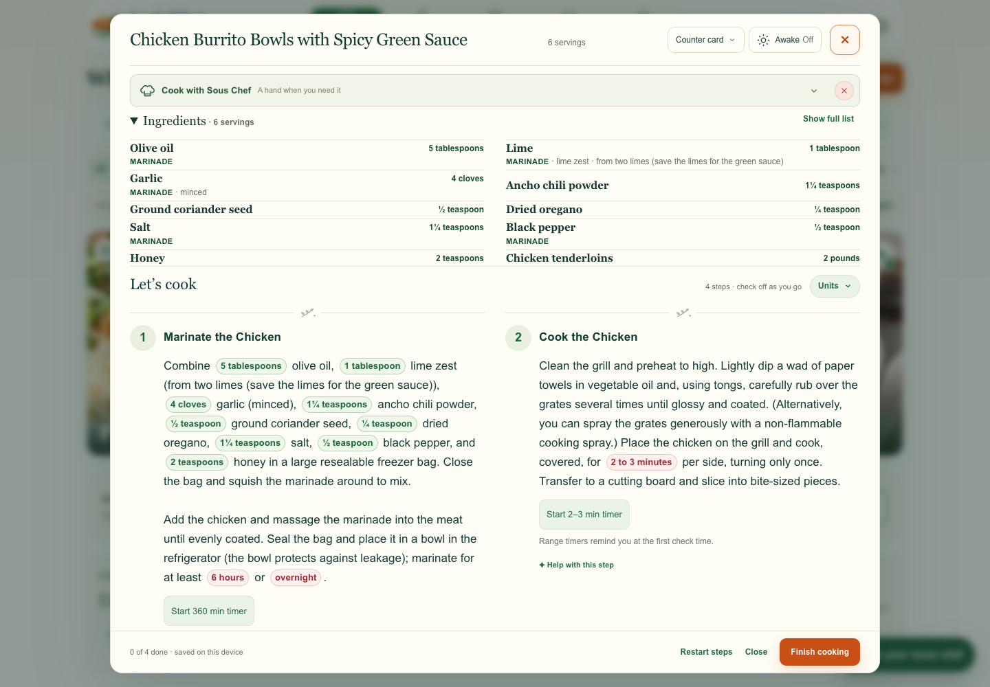
I asked to group related foods without adding headings, and questioned why rows with the same amount of content had different heights. The proposal gives each column its own row heights and uses small gaps between groups.
For this recipe, the open list is 13 px taller than the previous two-column preview because the food groups stay together.